Sometimes whenever I start working on a project, I get really into it and end up doing a lot more than originally intended. These Boeing 767-200 illustrations are a perfect example of that. My primary reason for creating a 767-200 template was so that I could render up one with The Delta Air Lines livery – one of the best looking airline liveries of all time if you ask me.
But once I finished, I thought that it would be cool to do one in the American Airlines livery. And if I was going to do that, I thought that I might as well do one in the TWA livery too. But that’s when I really started getting nostalgic, finding myself in Photoshop laying the colors for Piedmont Airlines onto another copy of my blank template. Oh – and I almost forgot that there was a USAir version created somewhere in between all that as well, which I’ll post it up on the blog soon.
The silly part? All of this happened in one 24 hour period. Sometimes my drive to create gets the best of me and it’s difficult to let go of what I’m working on.
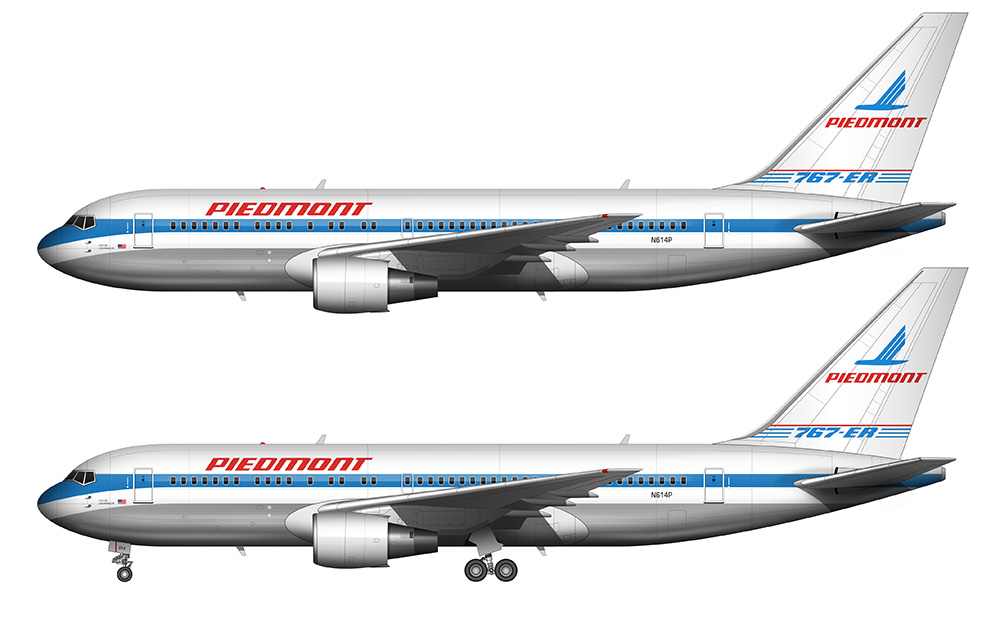
Anyway, back to this Piedmont 767 rendering. Piedmont Airlines was a small(ish) US airline based out of Winston-Salem North Carolina founded in 1948, and they eventually merged with USAir in 1989. I personally found it interesting that that they were solidly a US domestic airline with mostly short-range flights, but they did operate one single international route from Charlotte to London (Gatwick) utilizing Boeing 767-200 aircraft. Kind of an odd route for such a niche airline.
My illustration above is an exact representation of one of those 767’s. As with all aircraft liveries of the 1980’s, it sports a super-cool cheatline intersecting the windows right through the middle of the fuselage. Too bad we never got to see this brand evolve, as I do like their brand colors and logo quite a bit.
Long live the cheatlines!

Hello, love your illustrations, where do you get the base image to work on? Could you please provide a link for a base image, preferably in vector?
Thank you
Best Regards
AJ
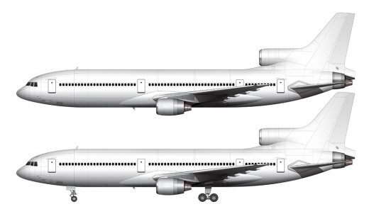
Hi AJ – the Boeing site has a pretty good collection of simple vector outlines that are quite handy:
http://www.boeing.com/boeing/commercial/airports/3_view.page
-Scott
I miss Piedmont, but growing up in Appalachia I’m probably biased! Still, I didn’t know that they actually had leveraged up to a 767 before being merged out of existence.
I’d love to see you hypothesize an evolution of their design. I could see the 3-feathered “bird” expanding in size – maybe with the body centered on the windows so the logo extended across the fuselage and the tail (a la Quantas or Air New Zealand)… then maybe “PIEDMONT” in big fuselage-high letters as in the latest United livery? Or perhaps the blue cheat line morphs into a flowing wavy line lower down, that swoops up into the 3-feathered bird at the tail? Fun to daydream…
Those are some great ideas Jeff! I will be doing a complete redo of this article (with a lot more information and illustrations) eventually, and I might be able to include a concept or two as well. It just depends on how ambitious I’m feeling lol.