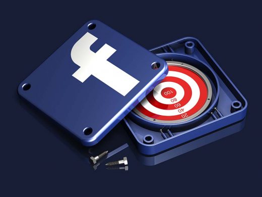
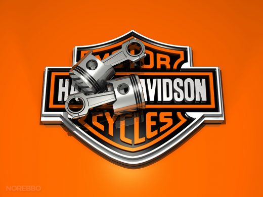
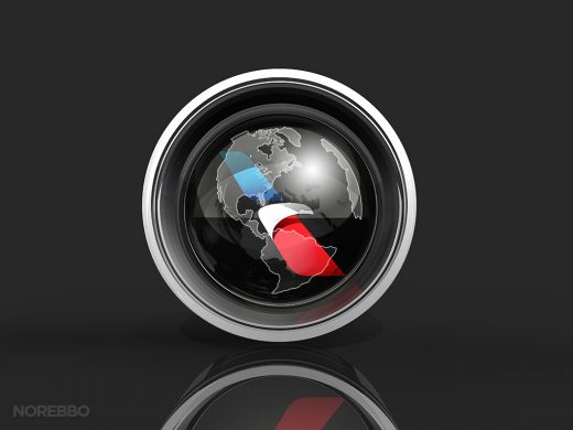
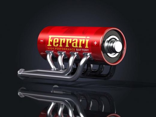
I’ve been making stock illustrations featuring the logos of popular companies for several years now, and up until this point, I’ve always focused on brands that are either interesting to me or very newsworthy in some form or another. On top of that, it’s pretty obvious that I’m pretty much entrenched into my own style of 3d illustration – l use lots of metal and glass textures with very limited color, and I’ve never been a big fan of trying to create overly-detailed artwork.
Simplicity rocks! I realize that my stye is definitely not everyone’s cup of tea, but to be perfectly honest, I’m not trying to make everyone happy. You either like my stuff or you don’t. 🙂
So what happens when I decide to break out of my comfort zone a bit and create a series of illustrations for a brand that I’d not normally consider? Let me explain…
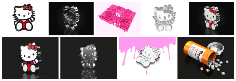
A certain family member of mine is a huge fan of anything related to Hello Kitty, and I’m not going to lie when I say that her interest in that little cat has affected me in ways I never thought imaginable. It’s to the point now where I know the history of the brand, all the names of the characters, and of course…I’ve seen my fair share of trinkets and gadgets adorned with bright pink and white Hello Kitty markings.
This crazy cartoon character has been etched into such a large portion of my brain that the choice to create a set of Hello Kitty stock illustrations was all mine – she had absolutely nothing to do with this. I realize that could be considered grounds for turning in my man card, but hey…I thought it might be fun considering that I don’t normally focus on these sorts of brands.
I knew right from the start that I wasn’t going to recreate Hello Kitty into a round, plush-like 3d character. That’s just not what I do. Instead, I wanted to see what would happen when I modeled the iconic shape of Hello Kitty in my usual ways, which means simple geometry built with industrial materials like metal and glass. It’s a very masculine style, I know, and I didn’t know what was going to happen when I applied that style to something so feminine.
Long story short, I don’t consider this image set to be one of my best. I guess that my expectations (and excitement) were too high, and there were a few frustrating moments along the way. Trying to create conceptual 3d illustrations which mix high-tech and industrial textures and objects with girly cartoon themes was not easy, and it was challenging to end up with illustrations that I felt were truly useful as stock imagery. In that sense, I don’t think I succeeded.
But to say that I’m happy that I got this out of my system is an understatement. It was a fun experiment, but I think I’ll stick with the “manly” brands going forward.
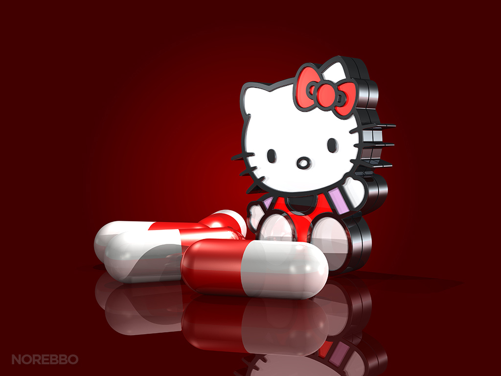

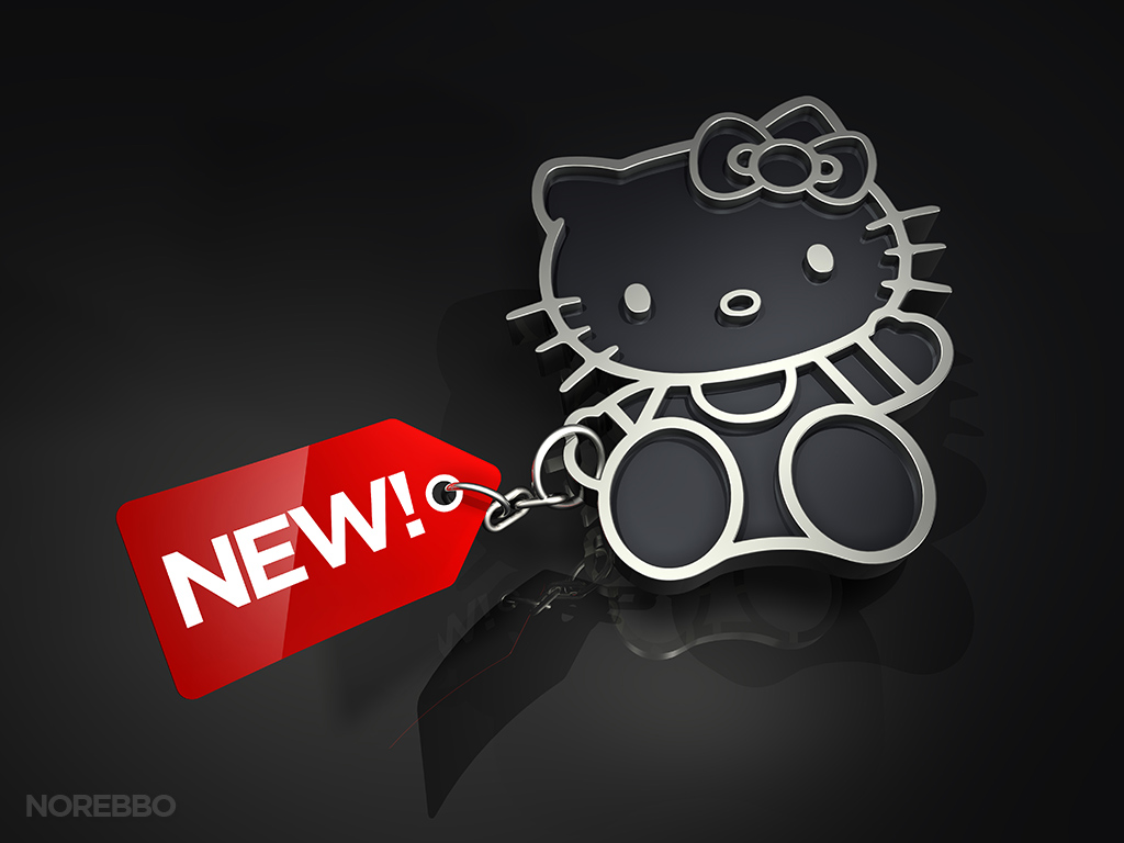
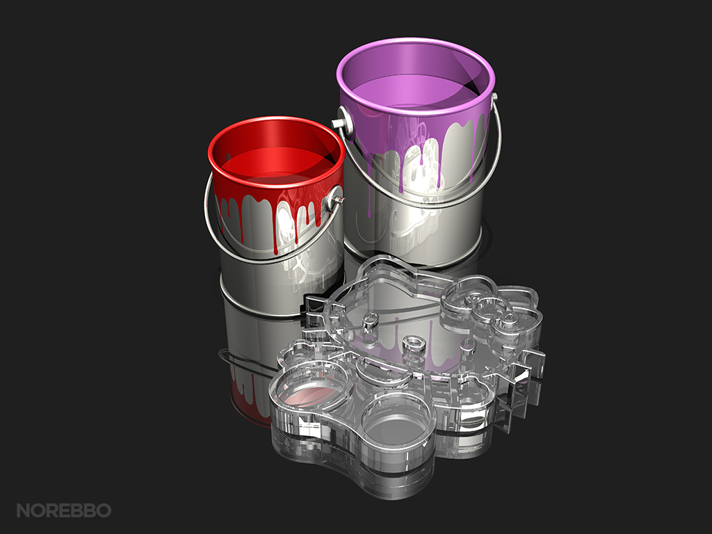
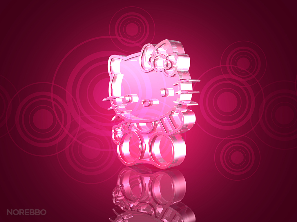
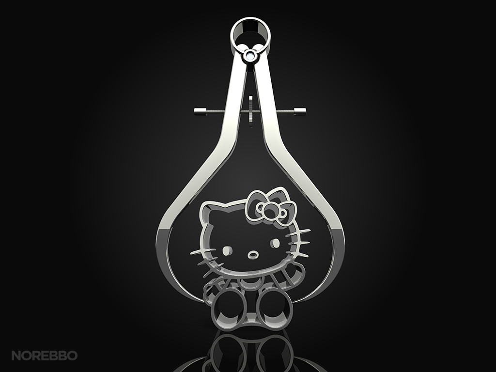
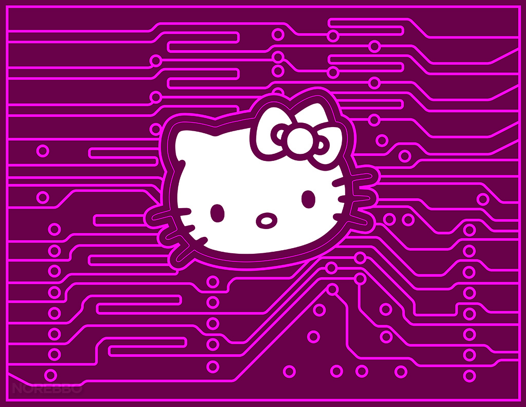
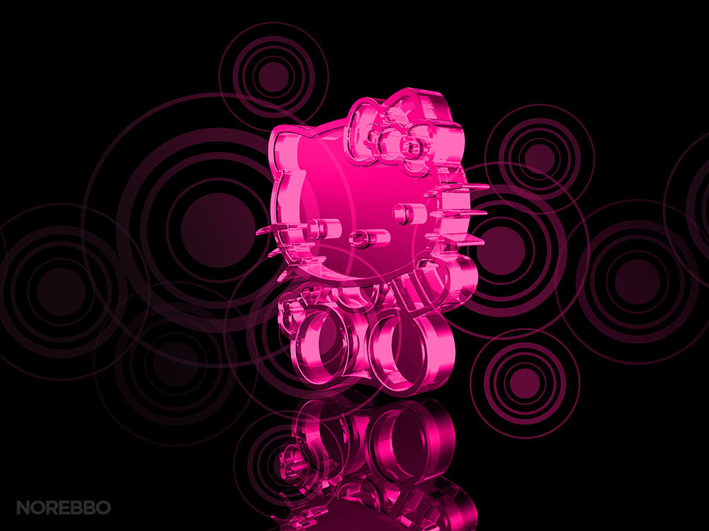
Here are a handful of others that I did, which I’ll upload at a later time:
