A lot of you seemed to like my Facebook app icon illustration set that I posted a few weeks ago, so I thought it would be fun to continue the theme of the series with the Google Maps logo. I had been planning on doing some sort of stock illustration series focused on Google maps for a long time anyway, so I thought this would be a good way to get started.
The only problem with doing 3d renderings of popular app icons is that they tend to be redesigned often, so I expect this series to be semi-short lived. But depending how popular these become, I may consider keeping them updated with the latest Google Maps visual identity whenever their design team gives it a refresh.
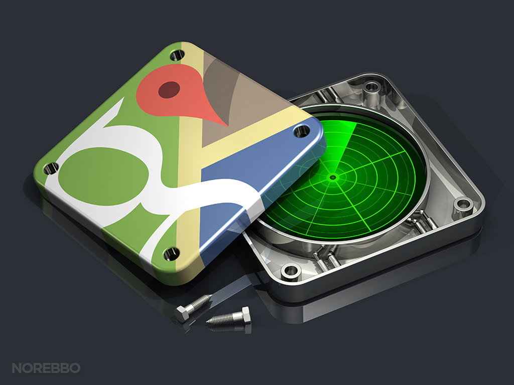
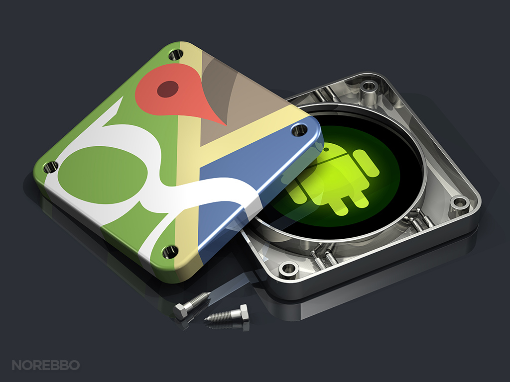
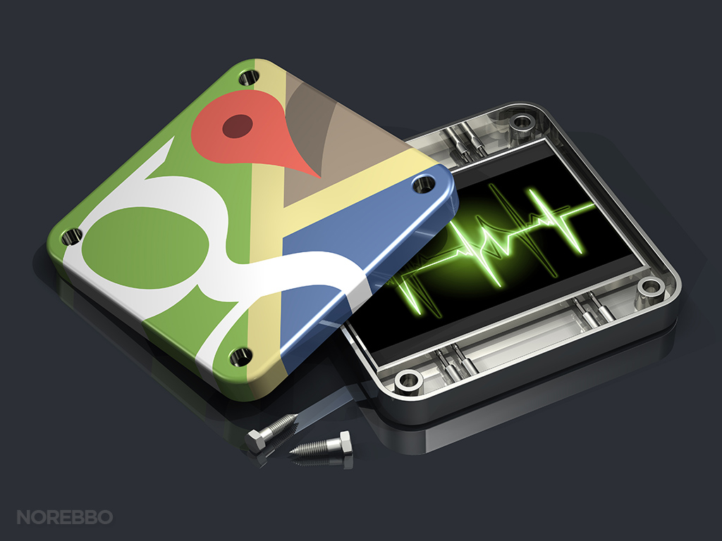
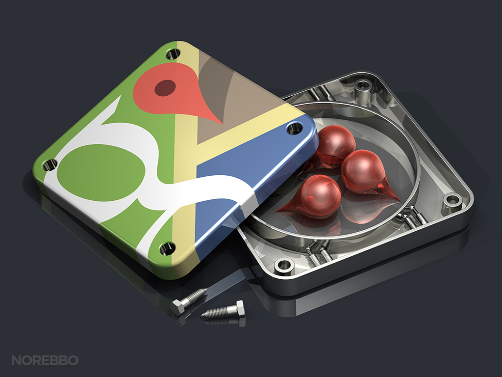
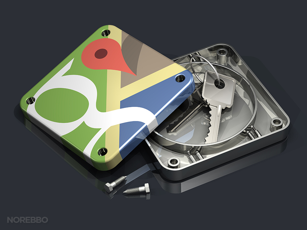
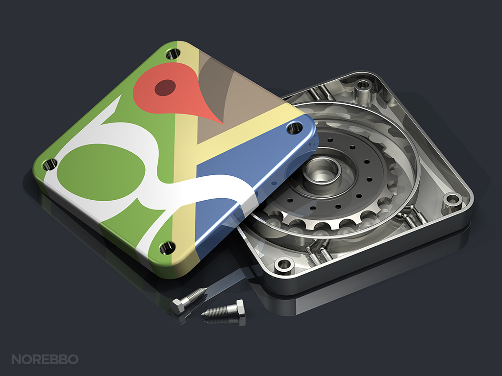
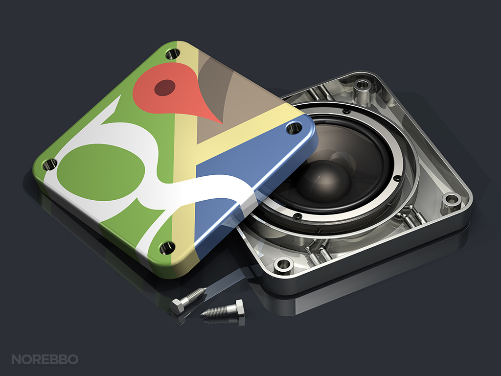
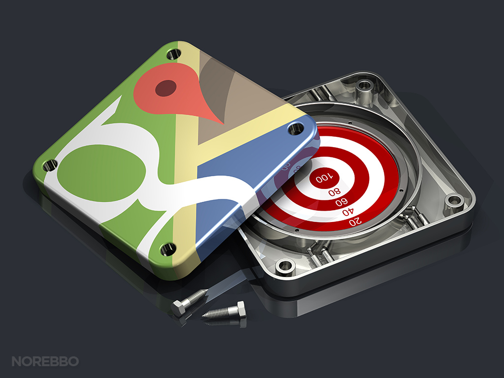
Just like that Facebook app icon series that I mentioned above, this set of Google Maps app icons features many of the same objects and themes. Each app icon is shown in two halves (as if it had been taken apart), showing the interior of the icon as an injection-molded piece of plastic (or stamped metal) with a conceptual object placed inside.
The funny thing is that I thought that I had a bunch of really good ideas for this image collection before I started, but the ideas weren’t flowing as freely once I sat down and got started. Hey – it happens from time to time. 🙂 Because of this, you should probably keep an eye on this collection in my online store because I have a feeling that I’ll be adding to the series as time goes on and the ideas pop into my head. I know those ideas are in there…I just need to get them out!
Anyway, I happen to like the Google Maps logo quite a bit. I’m a huge fan of the “flat” design trend that is all the rage at the moment, and I personally feel that Google does the best job with this. Unlike Microsoft and their Windows 8 *cough* Metro *cough* design language, Google takes just a step further with slight gradients and subtle textures. Really classy stuff, IMHO.




Photos extraordinaires
magnifique !!
un grand bravo
Merci Beaucoup! 🙂