Based on the sheer volume of requests I have received to illustrate the Douglas DC-3, it’s safe to say that it just may be the world’s most iconic aircraft.
I know. That’s hardly what most would consider to be scientific evidence (and/or irrefutable proof). But I’m calling it like I see it.
They were super cool when I was a kid (way back in the 1980s). They are super cool today. And I’ll bet my trusty Wacom tablet that it’s gonna stay that way for a very long time. So there.
Side view templates of the Douglas DC-3
Illustrating these old piston pounders isn’t anything like illustrating modern aircraft. I like that. It mixes things up a bit.
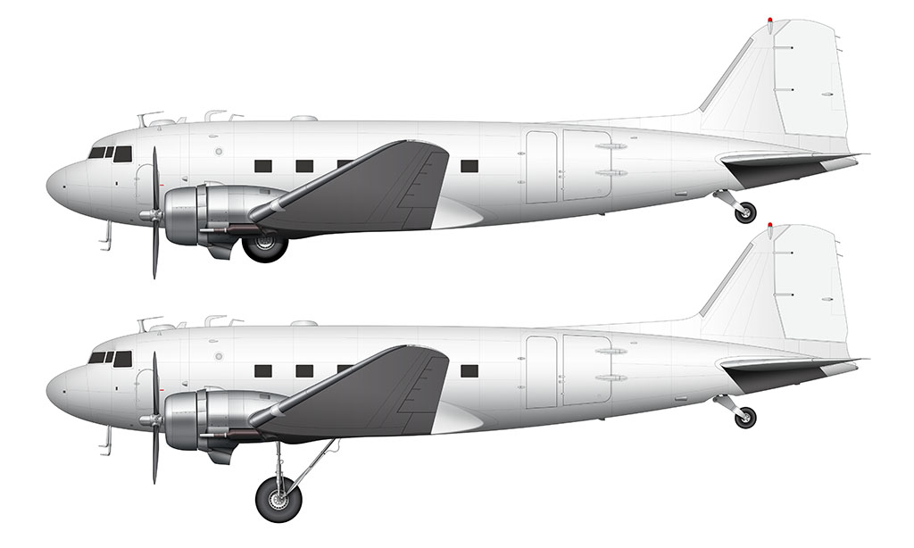
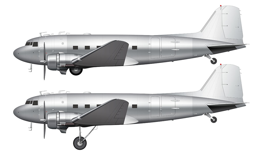
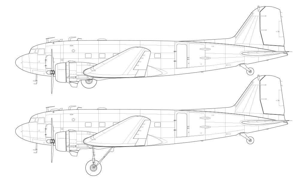
Note: the source files for these illustrations (which you can purchase via the button below) are 7000 pixels wide. That’s almost 8K resolution.
A few words about the template creation process
I actually wasn’t looking forward to doing these illustrations. The problem with old aircraft is that reference material isn’t all that great. Sure, there are lots of photos. But most of them are small, kinda blurry, and very poorly lit.
Thankfully, there are many DC-3’s still flying today. More importantly: it’s a popular subject for photographers.
Finding detailed reference material wasn’t difficult at all, which made the process of getting this done very easy(ish).
Thanks to everyone who pushed (and begged) me to create these drawings. It was fun.
The most interesting DC-3 design elements
My plan to use my DC-4 template as a base for these illustrations. However, as I was doing my initial research for DC-3, I discovered that that there was very little overlap between the DC-3 and the DC-4. It was just one of many interesting discoveries:
- Even though the main landing gear doesn’t fully retract, the exposed portion is nestled in (and protected) by the lower engine fairings. Very clever. Very stylish.
- The way that the wing blends into the fuselage looks very ahead of its time (to me anyway). It’s a very complex / organic transition that must’ve been difficult to produce at the time.
- The secondary door near the cockpit windows is something that not even the DC-4 had.
- The DC-3 was one of the last aircraft to feature square windows.
- The use of large sidewall (“balloon”) tires was brilliant IMHO. The natural suspension provided by running lower air pressure negated the need for complex suspension components in the gear structure itself.
- The rudder is absolutely massive compared to modern aircraft. They don’t make them like that anymore!
- The low-hanging pitot tubes are very unique – and I can only imagine how prone they were to being taken out by birds. Which actually sounds more horrific for the birds than the pilots the more I think about it…

this is amazing!!
I didn’t think you still made these!
Thanks! Yeah, I’m still here. I’ll probably be doing aircraft illustrations until I’m dead lol.
can you please do a C-130? i really need it
Honestly that one is pretty far down on my priority list. My C-17 template didn’t get much interest at all, so I can only assume that the C-130 would be the same.
I used your C-17 it was really useful
Thanks! I think you’re the only one lol.
i couldnt live without these, i find them so much fun to use
i use them to make vector planes at https://scratch.mit.edu/users/ShoutyCreationsOnYT/
these illustrations are super useful
your C-17 was amazingly useful, you can try to find in my scratch profile, it wasnt made too long ago
I DID TOO
And when will there be other planes that I wanted to see while commenting on the post with the A300
AN-225 is probably next. Maybe the Constellation after that? Not sure yet…
YES PLEASE DO THE AN225 I NEEED IT
Hey norebbo! Just want to say that these are the best aircraft templates I’ve ever seen! I make aviation art on the coding website Scratch. Your templates are a HUGE help in making my aviation art.
Thanks! I’m glad you’re finding these useful!
I use these for scratch too! they are my everything
I especially need a 747-200 freighter with CF-6 engines. And what other versions of Constellation will there be later. I know L1049G, L049, L649 and others
Oof. Good questions. I barely even know what I’m having for dinner tonight lol.
Is there a schedule for making new airline liveries?
Nope, not really. It’s mainly just whenever I find the time to do something new.
YIPPEEEEEE! THANK YOU!
You’re very welcome!
Please please please do the following:
Learjet 60xr
SAAB 2000
B-52
The B-52 would be a lot of fun actually. I’d love to do it, but I’m not sure how useful of a template it would be. Most everyone wants commercial aircraft it seems.
When there will be a cargo 747-200F with GE engines, I really can’t wait
Can you possibly do some fighter aircraft or more military variants of aircraft because your art is amazing and I use it to draw a templates for planes so I can add my own liveries to them so thanks. And ps CANT WAIT FOR AN225!!
Military aircraft aren’t really my thing. Maybe someday I’ll experiment a bit just to see if everyone likes what I come up with, but I’m probably sticking with the commercial stuff for now.
I really need a 747-200F cargo template with General Electric engines, I can’t wait.
Plus, I want to see the Airbus A321 P2F, Embraer E190F and ATR 72-600F freighters.
Please wait. 🙂 I’ve got a lot of other things I need to take care of before I can get to the 742F.
I am really interested in doing the A321 P2F though. I haven’t done any research on it, so I’m not sure how much effort it’s going to take.
Hey Scott! This is my first venture back here in a while and I was wondering about you making more Russian Models, I’m quite a fan of IL96s and IL92s amongst others of course. Anyway keep up the good work and I hope you have a good one!
Hey Remi! Yes, I will (eventually). But the ones that I already have don’t seem to be all that popular with my readers, so I’ve been reluctant to do more.
I wish a 737-300 w/ winglet
I did those a long time ago actually. You can find them here:
https://www.norebbo.com/boeing-737-300-blank-illustration-templates/
I meant with winglets
Can you do A321 P2F, IL-96 or B737-400SF?
The A321 P2F is coming very soon. I already did the 737-400SF though – you can find it in this post:
https://www.norebbo.com/boeing-737-400-blank-illustration-templates/
I hope for an AN-124
I’ve been working on an AN-225 for a while now (and it was going to be my next new all template release), but I’ve put it on hold for the time being. I just don’t think there’s enough interest in those types of aircraft for me to justify spending the time it takes to create the template.
I’ll eventually get to it, but I’ve got some other higher priority things to do first.
Could we maybe have the VC10? Would be very helpful to me for drawing my planes.
Maybe. Maybe not. 🙂 In all seriousness, vintage aircraft don’t seem to be all that useful / interesting to the majority of my audience. I’m not sure why.
I’m sure I’ll do it at some point, but it’s a lower priority for now.
Okay thanks
This DC-3 is amazing!!!! Can you remodify your design to make one for the Basler Turbo BT-67 please? Its a modern DC-3. Pease please. What is your next plane? I hope its a turbo-prop.
Whoa – that’s pretty cool. I had no idea that a modern DC-3 was a thing! I may eventually do a template of it, but it won’t be anytime soon unfortunately. The Learjet 60 (and then probably the Saab 2000) is next…
Oh wow thanks! The SAAB 2000 is pretty cool and the LJ60 is my fav little jet. Can’t wait!
How often do you post new drawings? Yeah the BT-67 is a modified old C-47/DC-3 airframe with terboprop engines and a slightly elongated fuselarge. The wing tips are also changed.
Not often enough unfortunately! I still can’t believe that I’ve never heard of this thing.
I am sure all of us cannot wait for your next drawing! They are amazing!
Thanks Klint! The one I’m currently working on is taking longer than normal due to a myriad of other things (other projects, travel, being sick, etc). I can’t wait for it to be published either lol.