Love it or hate it, the best thing about the Delta Air Lines livery is how consistent it’s been over the years. Every livery has been a subtle evolution of the previous one, and it has helped Delta to become one of the most recognized and respected brands in the world.
A closer look at how the Delta Air Lines livery has evolved over the years
I’ve illustrated a lot of Delta aircraft over the years, and the following is a look at some of the most historically significant. I’ll be adding to this list as I complete more illustrations, so do come again…
Dark-nose widget livery: 1982-1997
The is the livery that I think of whenever I hear somebody say “Delta”. It probably has a lot to do with the fact that this was the livery that I grew up with, and it was the one that Delta was using when I was a young boy just starting to get into airliners.
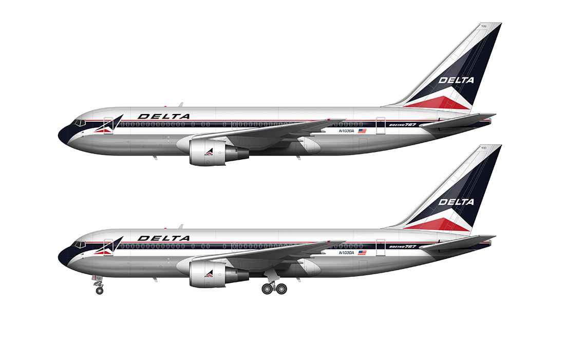
The livery has everything that you would expect with a classic airline paint scheme. It features a two color cheat line running down the length of the aircraft (a thick black stripe over the windows, with a thin red pinstripe above it). The Delta widget logo is displayed twice on each side:
- Once on the vertical stabilizer
- Once on the forward fuselage next to the main titles
This was one of the best airline liveries of all time in my opinion, although I never realized it at the time. It wasn’t until they moved onto the next one in 1997 that I understood how great it really was.
Ron Allen livery: 1997-2000
Delta airlines got a new CEO in 1997 (Ron Allen), and one of the first things that he did was hire Landor Associates to do a complete brand refresh (the same company that designed the new Etihad livery and the British Airways livery). It didn’t seem like an illogical thing to do at the time, since the Delta widget livery that proceeded it was over 30 years old at that point (in some form or any). It was time for a change.
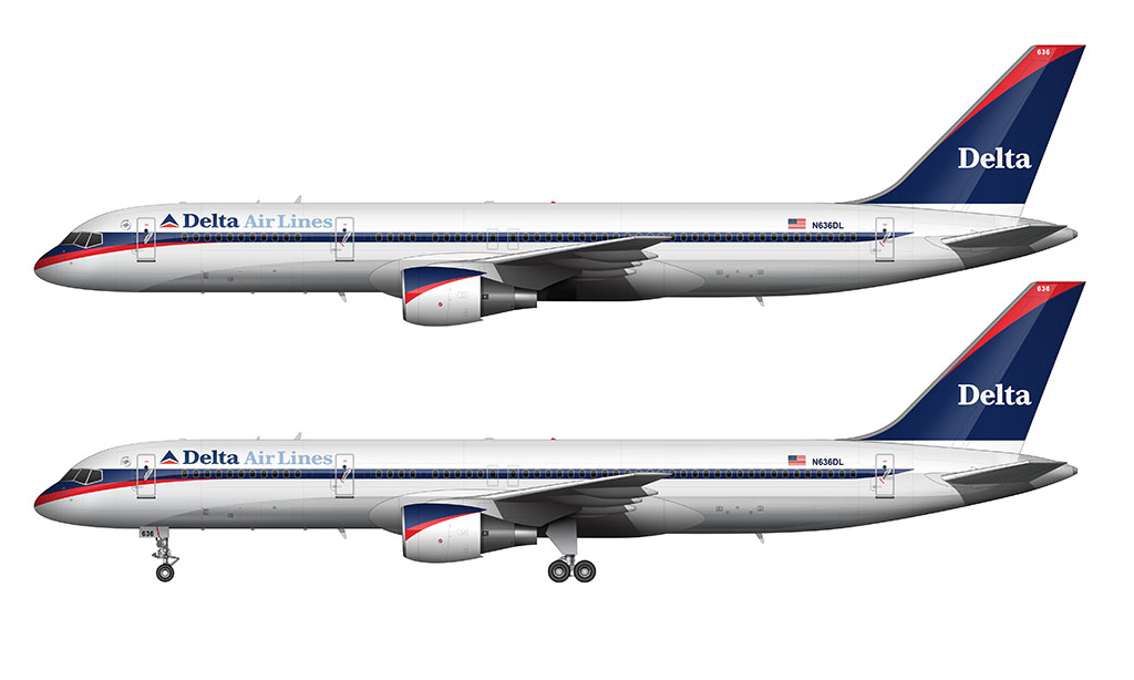
The new Delta livery that was unveiled in 1997 was brilliant in my opinion. It essentially took the best parts of the previous delivery and modernized them. The cheat line remained, as did the widget logo. Many of the same colors carried over as well, although they chose to brighten up the color palette by switching out the black with a lighter blue.
Personally, I really liked the Ron Allen livery. However, received very harsh criticism from straying too far from the Delta brand. It only lasted for three years before they gave up on it and start over from scratch.
Colors in Motion livery: 2000-2007
An all new Delta Airlines livery unveiled in 2000, and it was the most memorable of my lifetime (and not in a good way). I remember seeing a leaked picture of it on airliners.net the day before it was announced to the public.
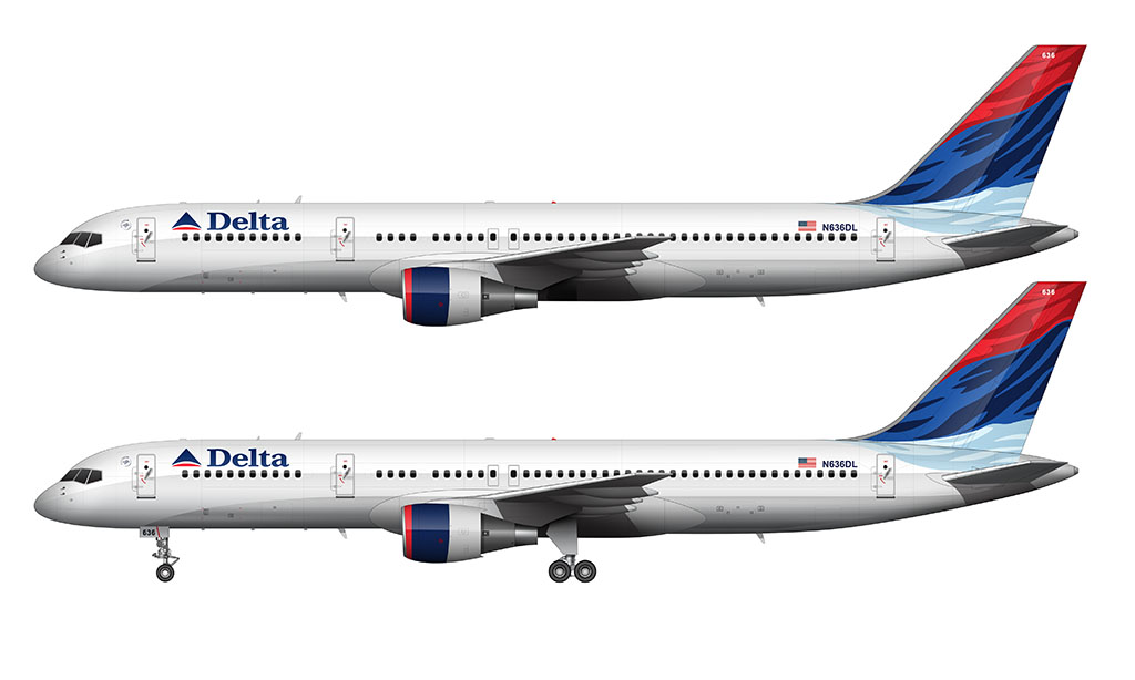
Everybody was losing their minds over it, thinking that it was the ugliest livery that Delta had ever come up with. I didn’t particularly hate it, but I was absolutely convinced that the picture that had leaked was of an unfinished aircraft. The vertical stabilizer looks great, but the all-white fuselage looked unfinished in my opinion. I was absolutely convinced that it was not the aircraft that Delta was going to unveil.
Boy was I wrong. Very next day, Delta proudly unveiled this new livery design and called it “Colors in Motion”. All over the Internet, people had other names for it such as:
- “Wavy Gravy”
- “Deltaflot” (since it looked so much like the Aeroflot livery of the time).
This livery was significant in the fact that it signaled the departure from cheat lines, and a switch to a more simple and clean design language better known in the industry as “Euro white” style. Whether everyone was ready for it or not, Delta had boldly decided to ditch the classic cheat lines.
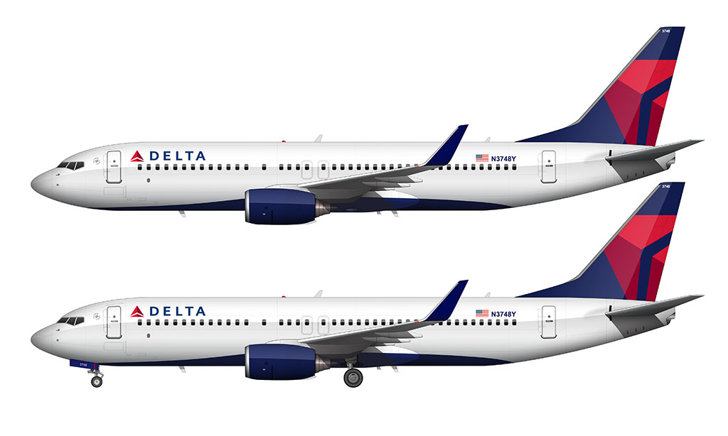
Onward and Upward livery: 2007-present
By 2007, Delta’s large fleet of aircraft were wearing three different liveries. Most of the 1980’s widget livery aircraft had been repainted, but there were still a few floating around.
And even though the Ron Allen livery only lasted a few years, there were still a handful of those in the system as well. Delta was still actively trying to get all of the aircraft painted into the the Colors in Motion livery when they (yet again) decided to bail on it and start over from scratch.
Compared to the American Airlines livery (one that hardly ever changes) it seemed as if Delta was facing an identity crisis.
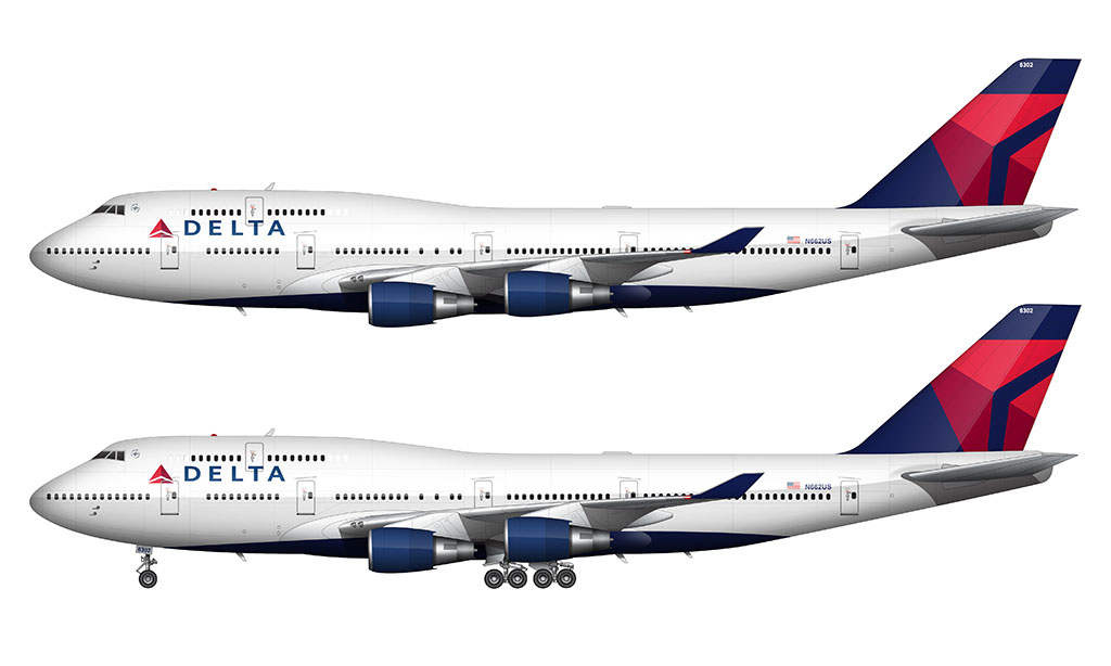
Thankfully, the Onward and Upward livery design was a return to its roots (somewhat). It brought back the widget logo as the primary design element, and featured more color on the fuselage than the previous livery.
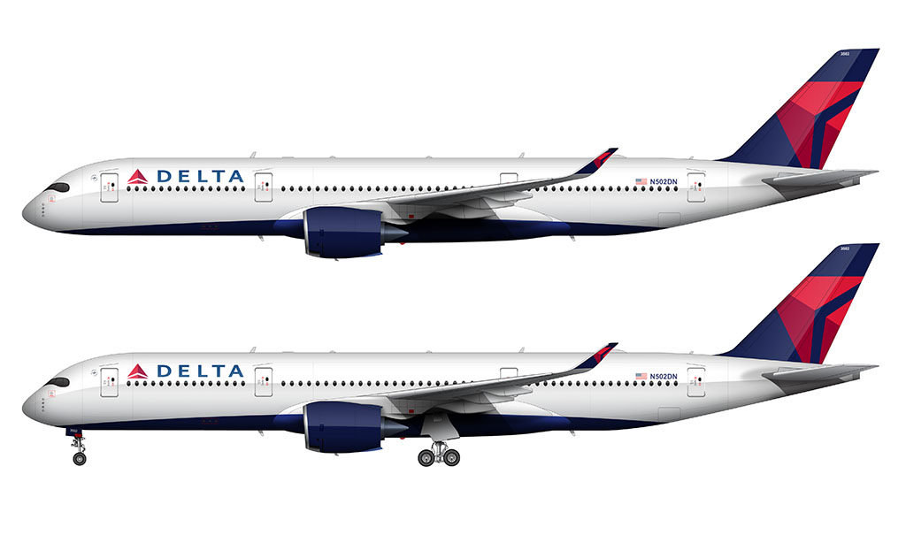
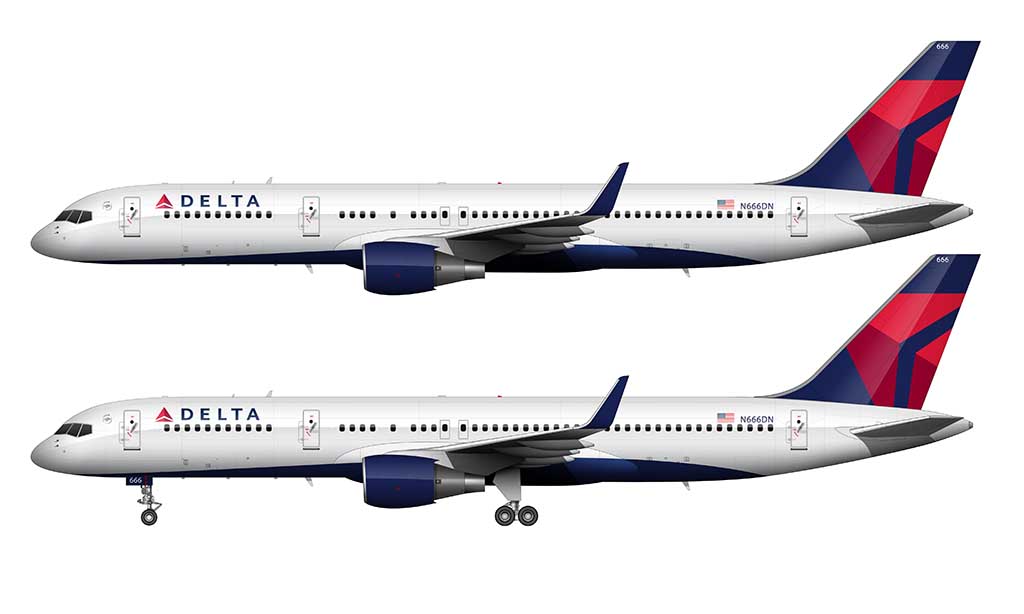
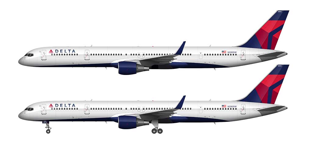
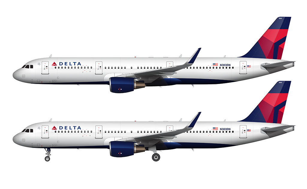
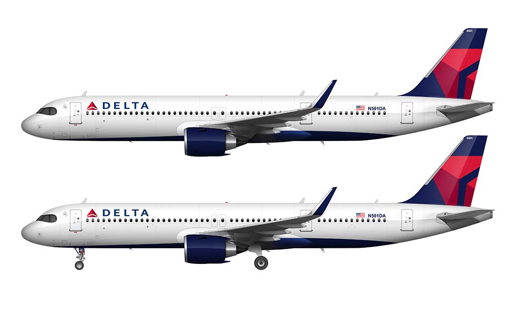
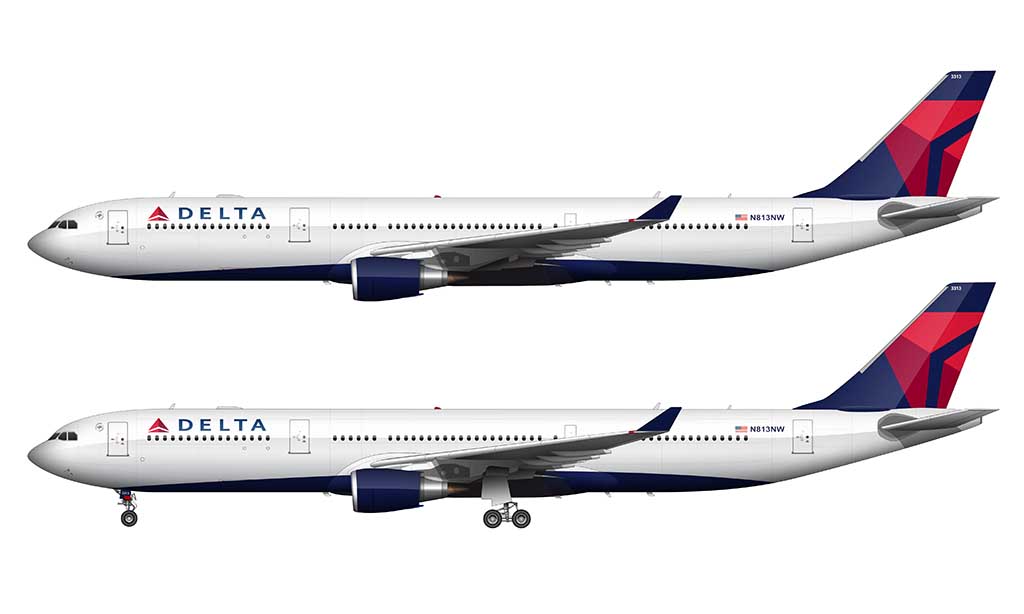

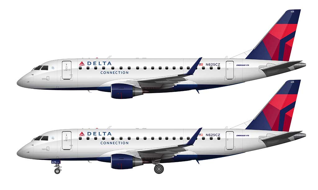
Note that while the majority of the fuselage is still “Euro white”, a subtle wave of dark blue covers the belly. Not only that, there is a predominantly large “Delta” logo (with the widget) painted underneath the aircraft so that it can only be seen from the air. It’s a neat design element that hardly anyone ever notices.

You have to take some time and do a Braniff livery or two at some point.
Those are coming! I need to create some “classic” aircraft templates in order to get those done, but it’s on my to-do list.
Do you happen to have this in an EPS file?
Hi Jack – unfortunately no, all of my fully rendered airliner liveries are created in Photoshop. Sorry!
First of all, I really enjoy your posts. But, the 1st scheme you refer to – “dark nose” – was not black and red. The cheatline over the windows was very dark blue, which matched the blue in the upper part of the widget. The radome and titles are black.
I had no idea it was blue! I’ll see if I can find exact RGB value and include in this post the next time I make an update. Thanks!
Hi Norebbo, I’ve been following you since 3 years now, I try to draw the airliners with the livery on them, One issue that I found out is that when I come to drawing the nose I always mess up and I lose courage in myself. If you have any tips please share with me
Hi Ayush – the key is persistence (and trying over and over again). One thing that helped me in the beginning was to trace photos of aircraft instead of trying to draw it freeform without any guides. It just takes practice!
the 2006-2007 delate livery with the waves must have been painful… reminds me of the Aeroflot livery which i am doing right now 😀
Believe it or not, it wasn’t that bad! Look closely and you’ll see that it’s just a series of basic (organic) shapes. Not all that complex actually.
Would be curious to hear you discuss fonts more – I think one of the big problems with the Ron Allen livery and Colors in Motion was the use of lower-case letters in “Delta” – that results in a kind of casualness that is at odds with the stark (Allen) / sophisticated (Colors) livery. Slap an all-caps “DELTA” on Colors, and it’s a huge difference in impression.
That said, I never liked the shift (pun intended) from the leaning widgit to a symmetrical widget – the earlier leaning widget exudes motion – whoosh, here we go – whereas the symmetrical widget is just … a triangle… a pyramid… it doesn’t say anything to me. IMO.
I’d just be happy if they took an A350 and applied the 1982 widget livery to it. My life would pretty much be complete at that point lol.
Interesting thought about the fonts. Typography is a challenging aspect of airline livery design – and it’s probably the thing I struggle with most. But you’re right – it needs to be talked about more.
Considering you’ve mentioned Aeroflot multiple times on this website, will we be seeing an Aeroflot livery evolution?
We just might! I really need to illustrate more Russian aircraft before attempting that though. It’s kind of a big job.
Can you do some Chinese Airlines?
I’m actually in the process of illustrating some older Cathay Pacific liveries – which will be posted here on the blog eventually.
Interesting note; there was a variation of the “Colors in Motion” livery with a black (or ultra-dark blue?) underside. I was only aware of its existence due to a picture my mother took of a Delta MD-80 in 2010. You can see this livery on one of their 777s if you search “delta airlines 2010 livery” on Google images; it should be the 4th image that pops up.
That’s pretty cool! I didn’t even know that existed. I can’t say that I like it though – it just seems a bit too busy for my tastes.
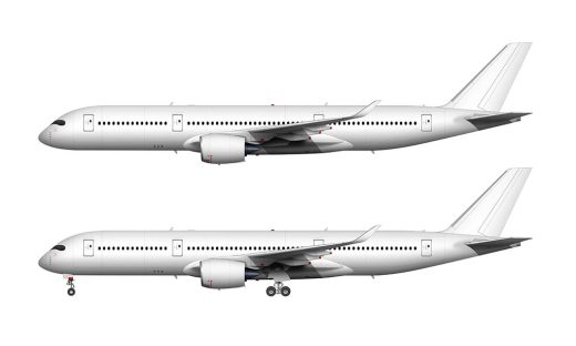
Fun fact: I’ve rode on N502DN (the A350-900 you illustrated) in real life!
I flew from HND-ATL in economy. It was pleasant although on the flight tracker it showed the A350 had the summer olympics livery… When that was long over by then
Pretty cool! That’s a long flight in economy class – even on a comfy aircraft such as the A350.
Also, N103DA, the 767 you made at the top, is now a plane for the US air force
Interesting – nice to see that it found life after Delta (which is where most airplanes usually go to die lol).