There are very few airline liveries out there that I like more than the Cathay Pacific livery (no matter which one it is). Arguably one of the finest airlines in the sky, their corporate branding has always been subtle and classy in a way that makes me compare everyone else in the industry to them – and it’s been that way ever since I was a kid and just starting to get into airplanes.
It’s difficult to put my finger on exactly what it is that makes me likes Cathay Pacific liveries so much, but you already know that I’m a fan of muted colors. The modern Cathay Pacific color palette has been designed exactly the way I would have done it myself: Clean, classy, and professional – without being over the top.
The Cathay Pacific “Brushwing” livery
Introduced in November 1994, the “Brushwing” livery is a perfect depiction of what it is. The tail logo features a representation of a wing, with a brush-like texture which sweeps upwards.
Although they operate a huge fleet of different aircraft types, I decided to do my first illustration of this livery on an airplane that is no longer part of their fleet: the 747-400.
This is the aircraft I think of whenever I think of Cathay Pacific, which (for years) was the backbone of their global operations. If you have flown Cathay Pacific to Hong Kong at any time during the 1990’s to the early 2000’s, there’s a pretty good chance you got a ride on a 747-400.
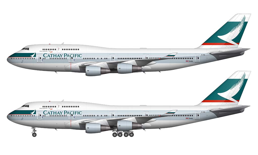
On a side note, creating the Cathay Pacific livery over top of my Boeing 747-400 side view template was a lot more involved than I thought it was going to be. The thing that takes the most time with these aircraft illustrations are the wings, and if you look at the overall wing structure of the 747, it appears to be rather simple.
From a side profile view, most of the under-wing detail is hidden by the massive Pratt & Whitney engines and their equally-large connections to the wing. But the way the wing interacts with the fuselage on this airplane is rather complex – even more so than the Airbus A350-900 that I illustrated.
Thankfully this livery is fairly simple in the wing area (with just a solid stripe of color running down the center of the fuselage). In a side profile view such as this, lots of detail in the livery can be blocked by the wing. It doesn’t happen so much in this case.
How does this livery look on the 777-200?
Good question! Personally, I don’t think the Cathay Pacific Brushwing livery looks as good on the 777 as it does on the 747. This is because of the large (tall) band of white on the upper section of the fuselage, which makes this look like a rather bland livery design.
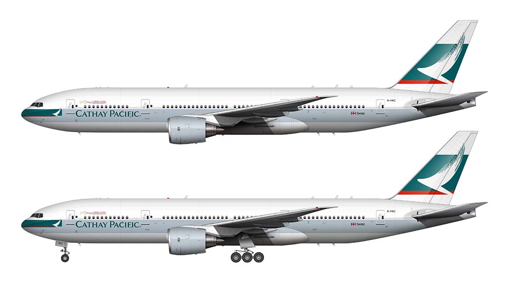
It’s still very much clean and classy though, and an airline livery design that will go down in history as being one of the greatest ever. Perhaps I’m being a bit over dramatic? Possibly. But I’ve never been shy about telling it like I see it…
The best way to sum up the Cathay Pacific livery is:
This is one of the best looking airline liveries that has ever been created (my opinion of course). The colors are soft and complimentary, the typography is clean and precise, and the logo itself is a classic that is an awesome representation of “flight”. It’s brilliant.

Do the Tropical MegaTop Livery (9V-SPK) pls
Can you do the new Cathay livery?
I actually have a full redo of this article coming soon(ish). There will be a lot more detail, with all new illustrations – which will include the newest livery of course.
Are you sure…? I’ve been waiting for 4 months
I know I know I know (lol). I’ve actually been really busy other projects so I had to put that aside for the time being. I’m trying really hard to get my DC-3 template out right now…
Maybe keep these templates and turn this into a Cathay Pacific livery evolution?
I think that would be kinda cool and you have all of the aircraft templates needed
(PLEASE DO CATHAY 707 AND 747 I’M BEGGING)