When I first started creating airliner art, it was the British Airways livery that I wanted to do first. Every version of has been both classy and cutting edge, and in my opinion, they set the standard for what proper airline livery design should be.
The following is a closer look at some of their most significant liveries over the years.
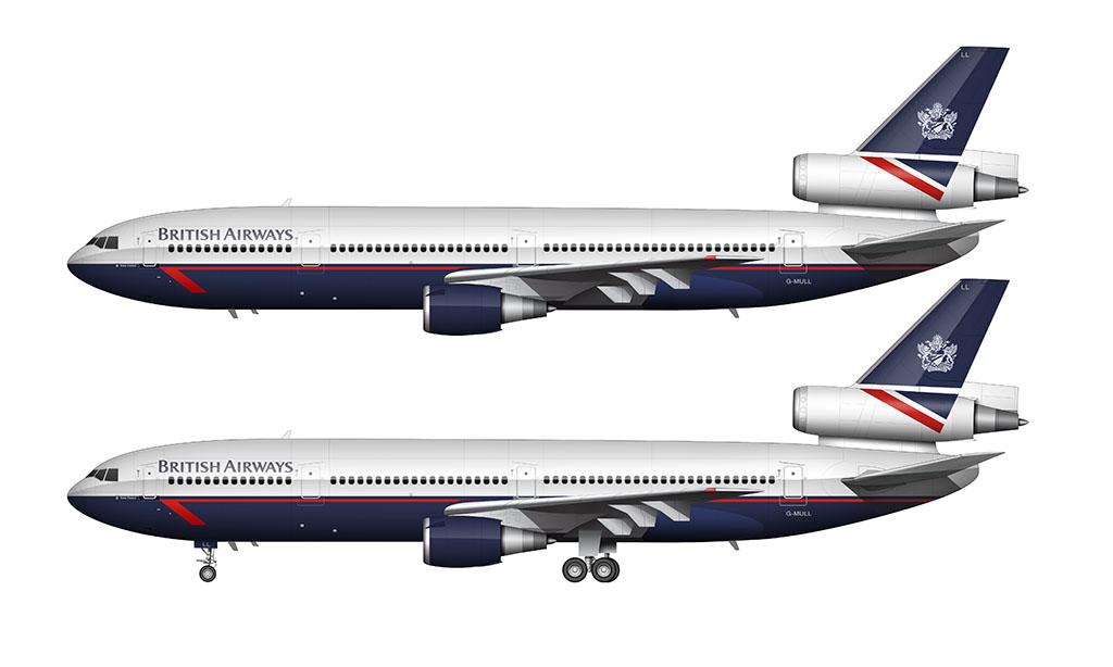
British Airways “Landor” livery: 1984-1997
Designed by Landor Associates, the 1984 British Airways brand refresh was nothing short of brilliant (in my opinion anyway). It was a creative mix of old and new, featuring dark blue blocks of color with red accents.
The only thing I don’t like about this livery is the contrast between the top and the bottom of the aircraft. It looks bottom heavy, as the blue color almost looks black in certain lighting conditions.
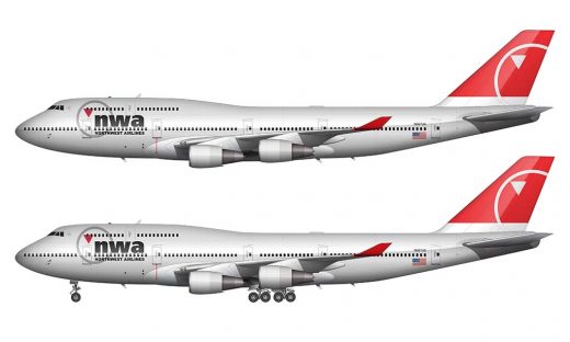
Note that I don’t think that using dark blocks of color is all that bad actually. The Northwest Airlines livery was notorious for this, and proves that it can be done without being overpowering.
British Airways Union Jack livery: 1999-present
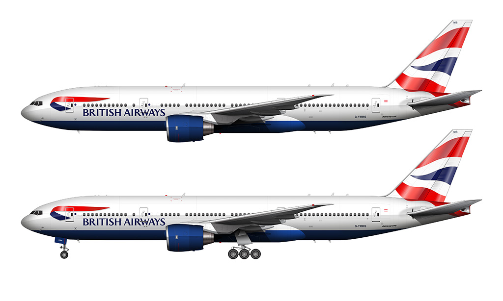
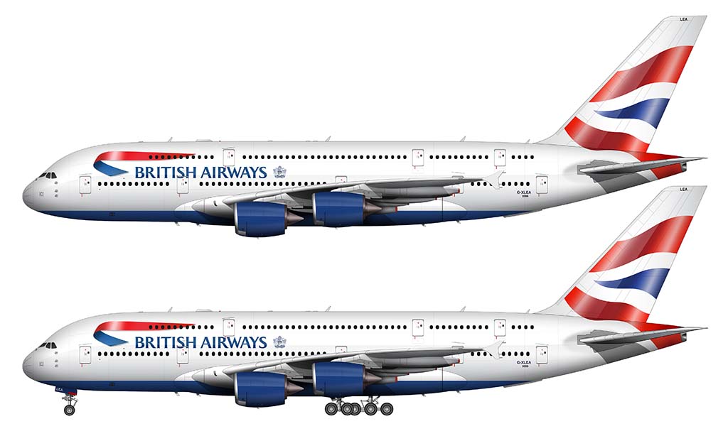
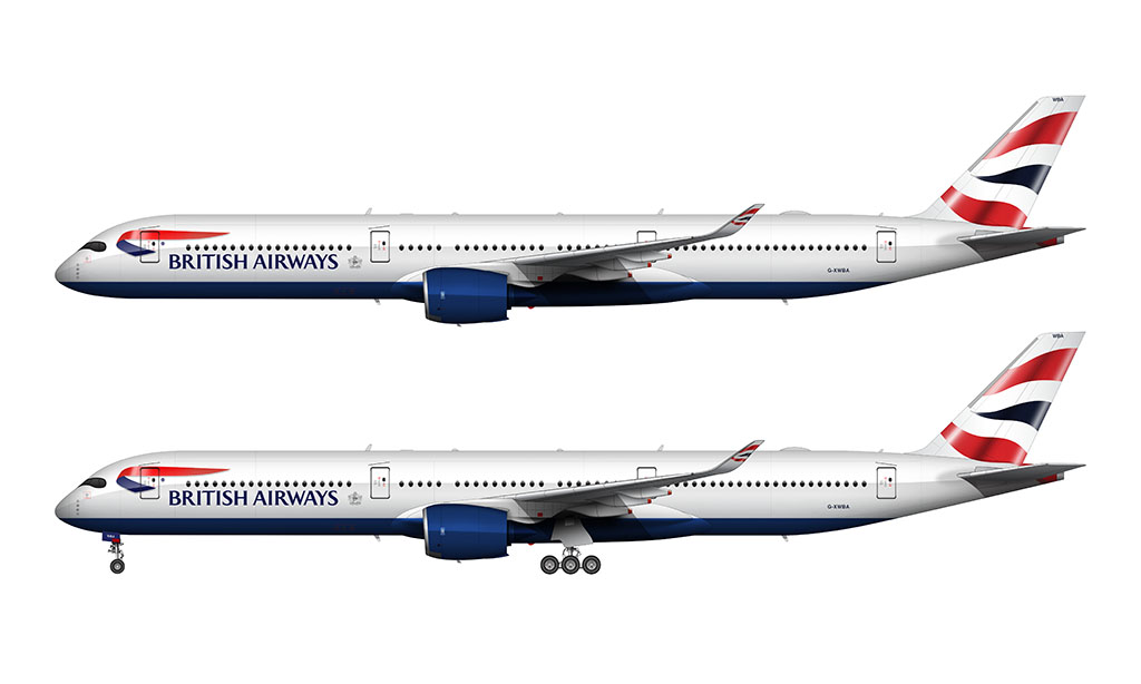
The livery announced in 1999 was an elegant evolution of the Landor design. It features the same blue lower section (though lower on the fuselage this time), and a stylistic Union Jack flag on the vertical stabilizer. This flag graphic (named “Chatham Dockyard Union flag”) was originally created for the Concorde, but it was decided to make it part of the official British Airways livery across the entire fleet of aircraft.
The main “British Airways” titles are larger, placed lower on the fuselage, and are framed by a red and blue 3d ribbon graphic.
Overall, it looks great. However, the flag graphic on the vertical stabilizer is a bit odd looking on some aircraft. I liked it when it was first unveiled, but over time I’ve come to notice how inconsistent and sloppy it is. It looks as if the designers traced a random photo of the flag in Adobe Illustrator and just plastered it on the airplane without much care to balance out the positive and negative spaces.
Even though I have created a near-exact reproduction of the tail art in the illustrations below, I can’t stand the fact that the lines are irregular and don’t flow as smoothly as I’d like. If it was the creative director for this project, I would have taken the time to smooth some of that out a little bit. It’s far too random for my OCD tastes!
Fun fact: there are different versions of this livery
I didn’t realize it before doing this illustration, but there are several versions of the Union Jack flag on the BA 777’s. The shape and complexity of the wave is different, and the newer version is a bit more wavy with smoother highlights.
The illustration above, by the way, features the older version on aircraft G-YMMS. I’m surprised they even made a change at all because I’m willing to bet that most people wouldn’t even notice that kind of thing.
How to draw the Union Jack livery
Illustrating the British Airways livery (the Union Jack version) was one of my most challenging airliner art projects of all time. Here is a video I created for my YouTube channel showing how I did it:
If I can find the time, I’d like to try and create a conceptual version of this livery with the flag graphic extending down into the fuselage. I’m not a very big fan of the way the dark blue runs along the base of the aircraft – it needs to be visually broken up somehow…

I always loved the Ethnic liveries from BA introduced in 1997. The Chatham Dockyard Union flag tail was part of it. But in order to have a uniform, not confusing, livery they painted al tails in to Chatham Dockyard Union flag. Would you consider doing a in depth view of the different Ethnic liveries tails?
Ah, yes – those were controversial indeed! I quite liked them actually, but it’s a shame that they got so much backlash. I’m planning on rendering a handful of those and adding them to this post…
I’d like BA to bring back the BOAC art-deco ‘Speedbird’ logo. The red tick on the Landor livery and that weird peeling ribbon design on the current livery aren’t a patch on the smart original.
Actually, going back to the white, blue and gold BOAC livery would be a major improvement. One of BA’s 747-400s was repainted in that design shortly before withdrawal and it looked seriously smart. And a complete rebrand of BA is needed – it’s a very tired airline charging premium prices for a less than premium service. Time to rethink it from top to bottom and break with the last 20 years of decline.
You’re absolutely right Mike – it’s definitely time for a full rebrand of British Airways. I’ve been tempted to create a few livery concepts of my own (just to get some conversations started), and I already know they’ll include some of those retro elements.
I second the comment on the BA World Image (Utopia) tails. A daring and distinctive program.
I was just looking at some of those yesterday (for the first time in a long time) and thought the same thing. They were brilliant IMHO – though very much hated by the general public at the time.