Finding the time (and energy) to create these side view airliner templates isn’t easy. Of course it’s fun, but it can be downright tedious at times and it’s hard to stay focused when I’d much rather be doing more creative work instead. But I’m staying on track with my goal of creating templates for as many commercial aircraft as I can, and this Bombardier Canadair Regional Jet 200 is the next airplane in that series of illustrations.
I’ve got a love/hate thing going on with the CRJ-200. On one hand, they are extremely cramped and uncomfortable, and I hate flying on them even more than the EMB-120. On the other hand, I personally think it’s one of the best looking commercial airplanes in the sky at the moment.
The fact that it looks just like a sleek private jet is what I like the most, and I went out of my way to fly on these things as much as possible back in the late 90’s when they were first introduced. I quickly came to realize how cramped and small they are on the inside, and it didn’t take long before I was avoiding them like the plague. I’d be a happy guy if I never have to step foot in one of these things ever again!
Drawing the CRJ-200 made me appreciate it’s design even more. Perhaps it’s because my last template was a less-advanced aircraft designed in the 1960’s, but I really like the forms of this little jet. Everything just flows together nicely, all elements (fuselage, wing, vertical stabilizer, etc) perfectly balanced. Even the panel sectioning is organized and clean – there aren’t too many places where it looks like swiss cheese all patched together.

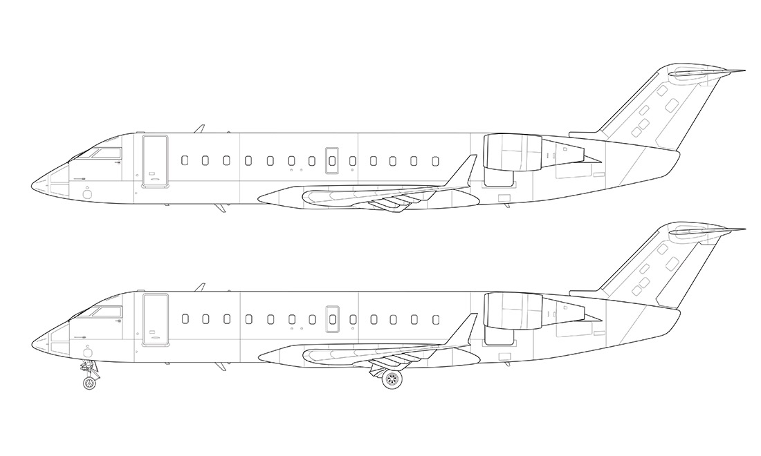

I also discovered some oddities about the CRJ-200 that I hadn’t noticed before. Did you know that the windows are not evenly spaced? There are slightly wider gaps between certain windows, but it’s hard to tell just by looking at it because the differences aren’t much.
But that spacing certainly isn’t consistent! Another interesting discovery is the front landing gear. Of all the airliner templates I’ve created so far, this one is different in two ways: first, it’s really complex (for reasons I don’t quite understand).
This is a small airplane, and it just seems odd that it’s a massively complicated piece of equipment clumped together with all kinds of sensors and parts. The second thing is the door flap. See how it opens from front to back rather than side to side? Pretty cool – and very unique.
Stay tuned for a template of the slightly larger CRJ-700, which is on my drawing board right now…




Check the Boeing 707… same nose gear door configuration (at least on the 707-436 BOAC flew).
Interesting – I had no idea! Strange how I never noticed that before (and now it makes me want to illustrate a 707).
Can you make a tutorial on how to design a livery using Photoshop? Cheers!
Yeah, that’s something I’ve been thinking about putting together so I’ll let you know if I end up doing it!
Hi Scott,
Do you have them in vector format?
Hi Rc – the only vector version I have of the CRJ-200 is the line drawing, which can be found here: http://www.shopnorebbo.com/collections/airliner-templates-line-drawings/products/bombardier-canadair-regional-jet-200-line-drawing?variant=1170975609
Where can i get a hold of the Bombardier Canadair Regional Jet 200 please?
Thanks