If you recall from my last post, I opened up the question about what my next template should be to all of you. I got a lot of responses and I really thank you for that – a lot more than I was expecting actually, which is quite good because it made my decision very easy. Most suggestions came in via email and Facebook direct messages, and I do appreciate everyone taking the time to offer suggestions for my next aircraft illustration.
The winner, which is not all that surprising considering recent events, was the Boeing 787-10. All of you aviation fans out there are probably aware that the 787-10 made it’s debut at the Paris air show this past week, and Boeing did an amazing job of showing this aircraft to the world. I know I was glued to the video stream when it was being announced – how about you?
The 787-10 has actually been at the top of my personal to-do list for quite some time. The problem was was there wasn’t really that much information about it up until this point and I didn’t really have enough reference material to go off to create an accurate template. But now that the aircraft is been officially announced with all the juicy specs and high res photos, it was perfect timing for me to go in and create these side view illustrations.
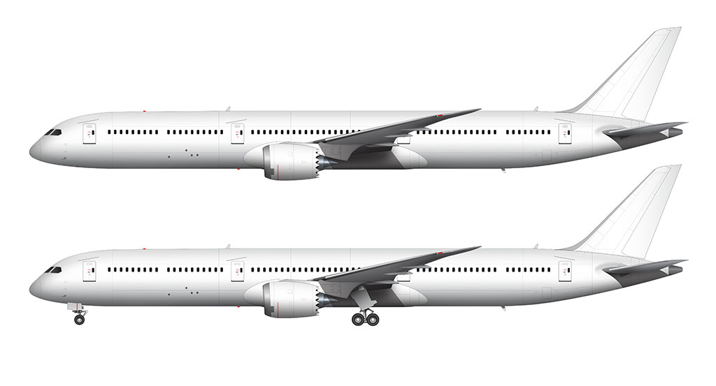
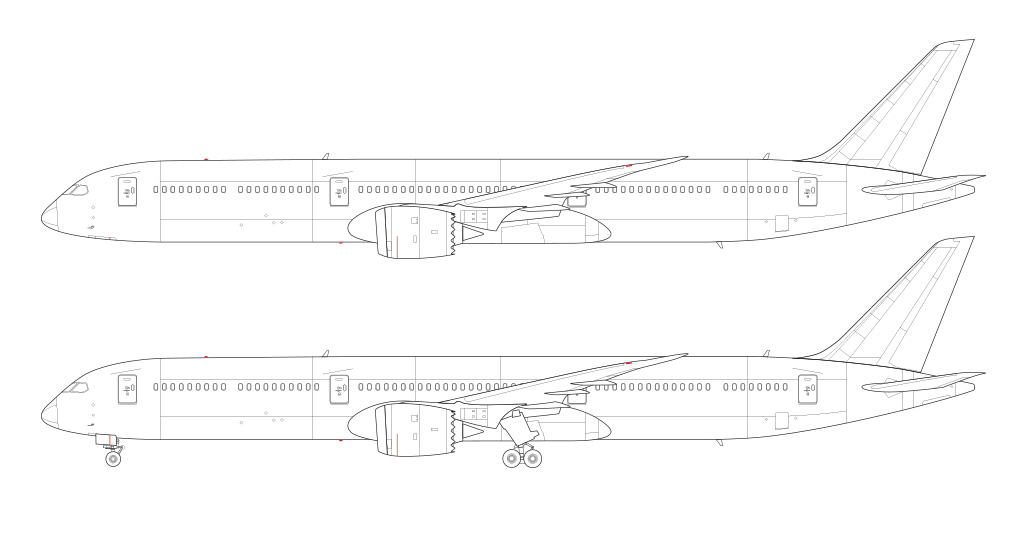

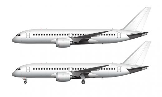
I’ll be completely honest when I say it was a lot easier than I thought it was going to be. One of the things that I learned in my research was that it was Boeing’s goal to reuse as many components as they could from the 787-8 and -9, and that meant that I didn’t have to redraw a lot of new parts and pieces. The biggest change obviously, is the lengthened fuselage which is stretched nearly equally both front and rear.
The other big change is the new main landing gear, but to me it doesn’t really look that much different from the previous version. So I didn’t have to do a whole lot with that – which is nice because it’s usually the landing gear mechanisms that take so long to draw. There were a few minor other differences and changes that I had to make but otherwise this was a very easy side view template to create.
Now that I’ve got three side view templates of the 787 completed, it feels natural for me to declare that I prefer the -10 the best. The -8 seemed a bit too short for my tastes, and while the -9 was starting to look better and more filled out, it just wasn’t enough.
The proportions of this lengthened -10 seem to make everything right with the 787. There is just enough overhang front and rear to make it look substantial yet elegant and not at all awkward like the -8, though it almost seems like they could’ve used a taller vertical stabilizer and taller landing gear to help with the performance of this aircraft. But hey – I’m not aircraft engineer, and all I know is what looks good and what doesn’t. Math has never been my thing!
Speaking of not being an aircraft engineer, I have to wonder how much more Boeing can do with these existing components. Any larger versions of the 787 are most likely going to require a new wing, bigger engines, and a whole lot of new stuff under the hood for increased efficiency. At that point, will it still be a 787? I really have no idea and all we can do is just wait and see what Boeing is going to do.

Are you making these wonderful templates using only Photoshop? I also want to design an original airplane.
Actually, I create all of these in Adobe Illustrator first, but I do all the detail work in Photoshop. It’s basically 85% Illustrator and 15% Photoshop.
Thank you for your reply. I’ll try.
Please do the 787-3!
I’m not sure that I would be able to resist adding a third engine to it (DC-10 style). 🙂