How embarrassed should I be that it has taken me this long to create side view templates of the legendary Boeing 727-100? Think of me what you will, but today is the day that I am checking it off my to-do list.
Side view templates of the Boeing 727-100
As a reminder, I’ve already created side view templates of the 727-200. And because the -100 is essentially just a shortened version of the -200, there should be no surprises here:
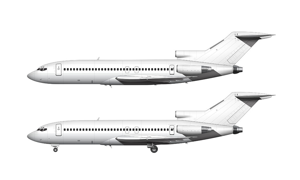

It still amazes me that the 727 was designed and developed in the 1950s. It looks just as sleek and modern as any current airliner, so to say that this thing was way ahead of its time is an understatement.
Need Larger Images?
Fully editable 5000 x 3000 px high-resolution source files for these Boeing 727-100 templates are available! Get them in JPG, PNG, PSD, and vector format.
First, a history lesson
You know how I just told you that the -100 is essentially just a shortened version of the -200? The proper way of saying that is: the -200 is a lengthened version of the -100.
That’s because the 727-100 came first (it went into service with Eastern Airlines on February 1, 1964). The -200 came almost four years later. Northeast Airlines got the first one of those on December 14, 1967.
The -200 was far more popular though, with 1245 total deliveries. In comparison, a total of 407 -100s were delivered (the last one in October of 1972).
Visual differences between the 727-100 and the 727-200
One of the reasons why it has taken me this long to illustrate the -100 is that I wasn’t looking forward to researching (and then drawing) all of the inevitable differences. It’s never as easy as simply changing the length of an existing aircraft template while leaving all of the other elements alone.
But guess what? Other than the following little details, there are no significant visual differences between the -100 and -200:
- The 727-200 had 44 windows on each side. The 727-100 only had 35.
- The shape of the number 1 and 3 engines (the engines attached to the side of the fuselage) are slightly different. Just slightly.
- The shape of the inlet for the number 2 engine was oval on the -100 and circular on the -200. This difference isn’t visible from the side view.
Major components such as the wing, landing gear, vertical stabilizer, and horizontal stabilizer are all the same.


Create Douglas DC-9-10 Templates
My first reaction to this was that the -10 was too niche (not very popular), so the likelihood of me doing it anytime soon was near zero. Out of curiosity, I just checked production numbers, and I see that it was a fairly significant variant – at least in terms of overall sales. I had no idea!
Maybe I’ll add it to my to do list…
Beautiful like always! Do you have any plans to make Antonov An-124, 74, or 26 soon?
Thanks! Yes – an Antonov aircraft is very likely going to be one of my next all new templates. I’m just not sure which one yet…
Pretty cool! Would you plan to make IL86, or 96?
Thanks! Those are a little further down on my to do list, but I’ll get to them – eventually!
Hi 😀 I was the first comment on the last template and I was kinda hoping you would do this for a long time. So happy to see it done! Also I have one suggestion: Maybe try updating some templates?? (Some are like over 10 years old now from what I know)
Hi Robinimo! As a matter fact, I have updated a handful of older templates over the past few months. You may need to clear your browser cache to see some of those updates (the updated images aren’t swapping out immediately).
Nice to see the return of the comment section here at Norebbo! IIRC I discovered this website in early 2022 and the first few times I read it there were a few comments on every post.
Anyway, about the 727, I honestly think it’s the best-looking aircraft, ever (at least commercial). It looks incredibly sleek, from the shape of the nose, the clean (engine-less) wings, the shape of the tail, and even the way the engines are clustered together at the tail, which somehow works and doesn’t look too tail-heavy. Just what a looker! And between the two variants, I think the -200 looks better as it’s just as sleek but the longer fuselage adds a bit of elegance. The -100 just looks fast, which still isn’t bad at all.
I too am happy to have it back! Comments were off for a couple years as I wasn’t really doing much illustration work, but I’m back at it and enjoying the community aspect of this. It’s motivating!
And I agree with you about the -200. Longer is better (as some would’ve heard her say).
Thanks for this beautiful version albeit it was a month late for me to process it in June. For what it’s worth I just assumed you were leaving plebs like me to adapt your 727-200 model into a -100 ( …I jest of course), but which is exactly what I had done prior. When compared to this new model of yours, I was pleased to see I wasn’t too far off the mark. Besides length, there were other more subtle visual differences which I also adapted.
FYI, the RNZAF examples I illustrated were ex-United Airlines 727-22 versions that were modified to 727-100C classification with cargo door fitted in the mid-1980s. I had illustrated both RNZAF liveries – they look great, and my wife just has had the later version framed for Xmas. It looks simply awesome!
You’re very welcome! I had originally planned to do the -100 at the same time that I did the -200, but other projects got in the way and…well…yeah. lol Sorry for the delay.
I don’t think I’ve ever seen the 727 in the RNZAF livery – but I can imagine how nice it looks all printed, framed, and hung on the wall. It’s a beautiful aircraft!
The 727 is a gorgeous – yet loud – airliner, calling it ugly shall put you in prison for at least 25 years.
Not just prison – it should be automatic solitary confinement as well!