The ANA livery is unique in that it’s one of the simplest – yet one of the classiest – in the airline business. This is my opinion of course, but it’s hard to deny that the colors of All Nippon Airways are beautiful (no matter what aircraft type they are painted on).
Consisting of just 4 colors (white, gray, and two different shades of blue), this livery extends the entire width of the fuselage in a striking “directional” wedge. Most importantly, it’s far more creative than the JAL livery.
Better looking airplanes may not persuade travelers to choose one airline over another, but it does help to build brand awareness. ANA is succeeding magnificently in that regard.
The ANA livery on an assortment of aircraft
ANA operates an extensive fleet of aircraft types, and this blue and white “wedge” livery looks great on all of them. From the A320 to the 77W, it’s a beautiful design which lends itself well to the general shape of any aircraft.
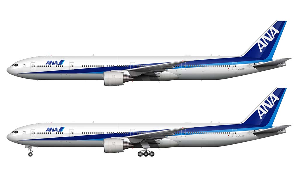
Boeing 777-300/ER
The Boeing 777-300/ER is an odd-looking aircraft in side view. It’s extremely long and thin, which makes sense considering that it has just as much capacity as a 747-400. Thankfully, the All Nippon Airways livery makes it look good.
Boeing 787
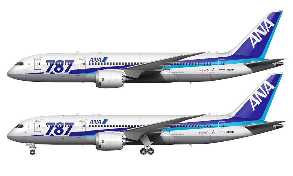
ANA was the launch customer for the Boeing 787. All the Norebbo OG’s out there will remember that the first livery that I ever painted onto my Boeing 787-8 template was the Japan Airlines (JAL) livery. It’s not like I was trying to go in chronological order or anything, but I should have done the All Nippon Airways version first.
This particular ANA color scheme (below) was modified to celebrate the launch of the 787. It features very large ”787″ titles at the forward section of the fuselage, while the rest of the livery remains standard-issue ANA. This livery was was ANA’s special livery for all but two of their 787′s shortly after launch of the aircraft.
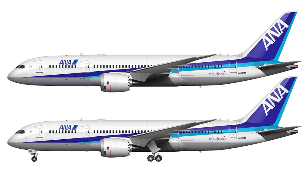
The illustrations of the livery depicted below actually came before the special 787 livery (above). Since ANA was the launch customer for the type, Boeing had to do a lot of final testing on the first 2 production aircraft before finally handing over the keys (figuratively, not literally). These well-used aircraft were ultimately delivered as brand new aircraft to ANA.
However – before taking delivery, the aircraft were stripped of the standard livery (below) and painted into the special 787 livery (above). It makes my head hurt trying to get the timeline in order, but that’s pretty much how it all went down.
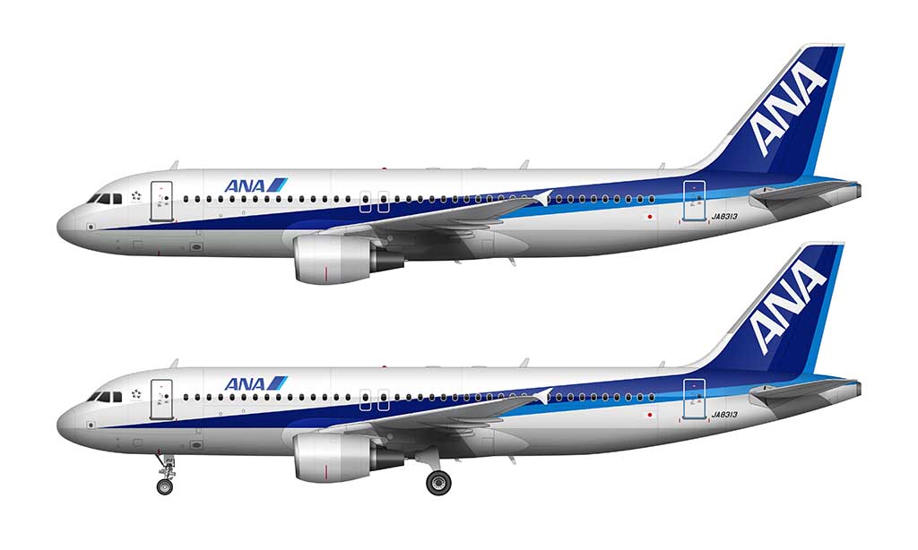
Airbus A320
Even on smaller aircraft such as the A320, this livery holds together well. The blue is far more prominent than it is on larger aircraft types, but the “wedge” remains intact. I actually like how much more condensed it looks.
Color palette
Although far from being the most colorful airline livery in the world, The ANA livery is pretty much the exact opposite of the competition (*cough* Japan Airlines *cough*). It’s a fairly complex design consisting of four basic colors:
- Fuselage: #fFFFFF (R=255, G=255, B=255)
- Gray Underbelly: #b6b7bb (R=182, G=183, B=187)
- Dark Blue: #29239b (R=45, G=35, B=155)
- Light Blue: #00afe3 (R=0, G=175, B=227)
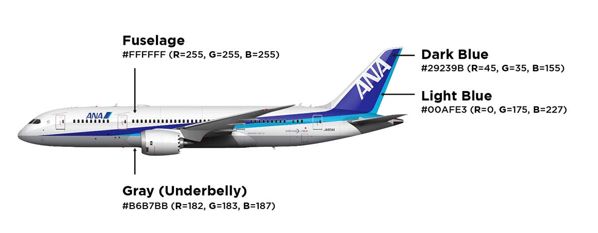
Because of how simple the color palette is, I can imagine how neat it would be to create special liveries with alternate color schemes. They would completely change the look of their aircraft with a simple color change, and it wouldn’t involve messing with the basic design elements. That’s pretty cool.
Pros and cons of the ANA airlines livery (my opinion anyway)
There’s a lot to like and dislike about this livery. I mostly liked it until I attempted to illustrate it on the several different types of aircraft you saw above. I noticed some inconsistencies (the good kind), and it made me rethink how good of a design solution this really was. The easiest way to explain what I mean is to give you a list of pros and cons:
Pros
- There’s no mistaking this livery for the livery of the other major airline in Japan. Being so different from the competition and using bold colors is a good thing.
- The ANA livery is pretty much the modern equivalent to the vintage “cheatline” liveries of the 1970s and 80s. I loves me a good cheatline.
- The fact that this livery needs to be adjusted for every type of aircraft is applied to it just goes to show you how much care the original designers put into this. Not only that, it says a lot about ANA management and how much they care about a little details.
Cons
- Inconsistency! The thickness of the stripes that run the length of the fuselage varies greatly from aircraft to aircraft. On longer airplanes such as the 777-300/ER, the stripes are thin and long. On shorter aircraft such as the A320, they are thick and stubby.
- The dark blue paint fades quickly (which in turn makes the airplanes look old and run down). Using dark colors in Airline liveries always looks great, but it always comes at a cost.

As a fan of ANA, I love your analysis and totally agree. One thing bothers me is that dark- and light-blue coloured area ratio change depending on aircrafts. On 787, light-blue has a wider stripe than dark-blue (on the body side, not incl. the tail), but A320 has the other way around. I think they should have fixed width ratio for all aircrafts, dark : light = 3:2 for instance. What do you think ? Thanks
I agree – it should be standardized across all aircraft types. However, if there is one thing that I’ve learned about doing so many aircraft livery illustrations over the years, it’s that not all liveries work the same on all aircraft types. Thats why, whenever designing a livery from scratch, I’ll always try it on a variety of aircraft before declaring it “complete”.
Thanks for your comment, yes I can imagine you have to deal with different variables depending on aircraft types, different tail angles, body widths, moreover the bodies have curved surface … and you have to make it “fit”.
BTW can you do for “Peach Aviation” livery? It’s designed by Neil Denali, an architect
Can you make the Ana A380 please scott
Those Honu A380’s are beautiful! I was in Hawaii a few months ago and I was able to get some decent high resolution photos of the orange one – I’ll get to it at some point now that I have some good high resolution reference material.
Oh yay the orange one is my favorite.