Is there a more iconic airline livery in the world than the American Airlines livery? Ever since the launch of the airline in 1936, American Airlines has taken great pride in expressing their brand philosophy onto their fleet of aircraft.
The Astrojet livery: 1964-1968
Designed by Doyle Dane Bernbach, the American Airlines Astrojet livery was significant in that it introduced the iconic double-A (“AA”) logo that is still in use to this day. It’s a relatively simple livery design overall, featuring the signature red “lightning bolt”graphic that was used in previous versions.
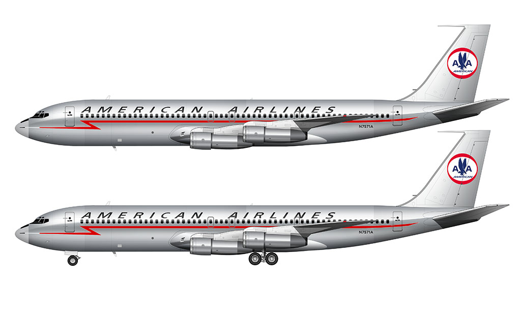
The main difference from previous versions was that the lightning bolt started at a single point on the nosecone instead of blending out from it.
On the vertical stabilizer, the American Airlines logo was redesigned into a circular graphic featuring eagle wings and double A’s (which represented “American Airlines” – not boobies).
The classic bare metal “Eagle” livery: 1968-2013
Created by famed designer Massimo Vignelli, this bare-aluminum livery was minimal yet timeless. The colors of the American flag (red, white, and blue) ran down the center of the fuselage, while a stylized eagle logo (with American Airlines abbreviated as “AA”) was painted on the tail.
The amazing thing to me is that this livery (designed in the 1960′s) lasted as long as it did. Is there any other major airline livery that has lasted so long? It’s pretty interesting to think about, especially since other US airlines like Delta and United have gone through 3 different color schemes each from the mid-90’s to the mid-2000’s. Talk about an identity crisis!
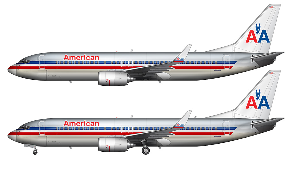
It was sad to see this American Airlines livery disappear. It was time though. Cheat-lines are oh-so 1970′s and American desperately needed to shed it’s old and tired image and step into a new era of quality and service to reflect modern times (and increased pressure from competition).
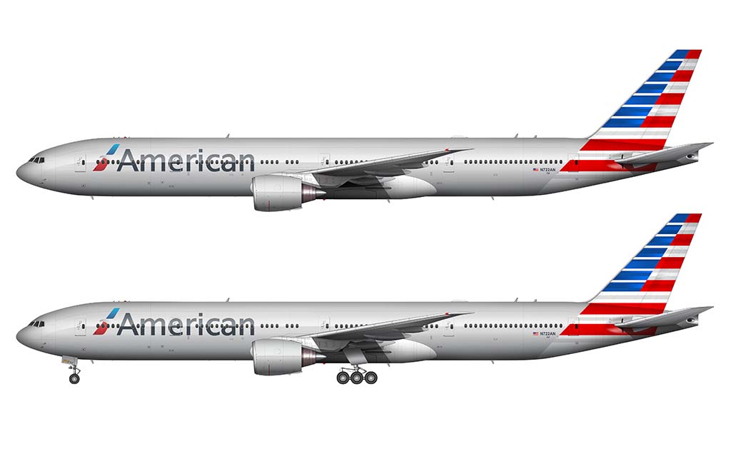
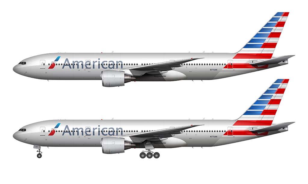
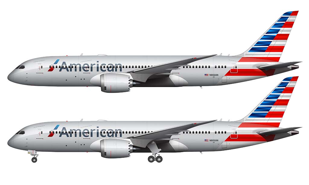
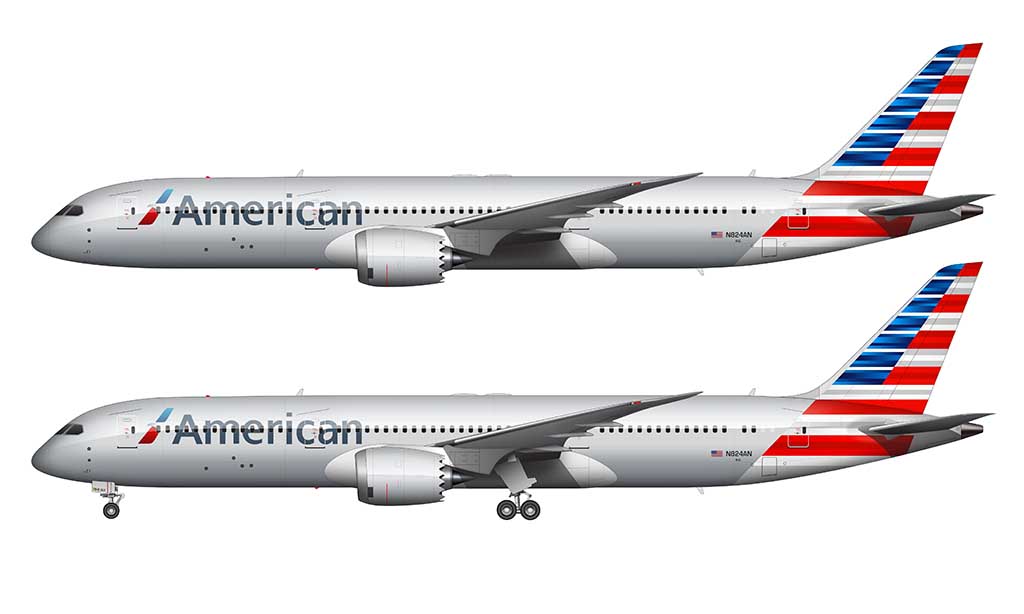
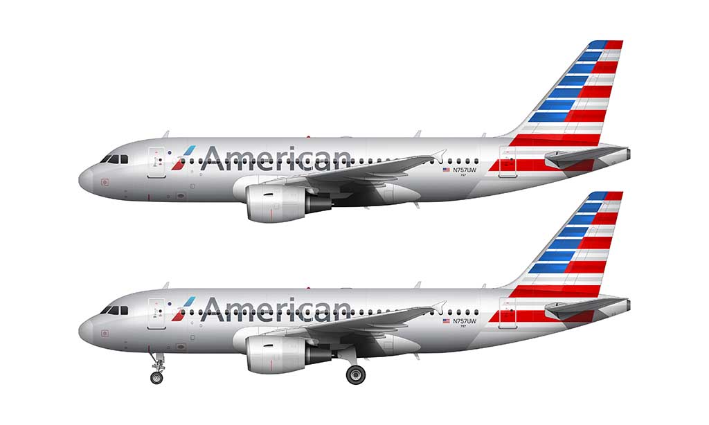
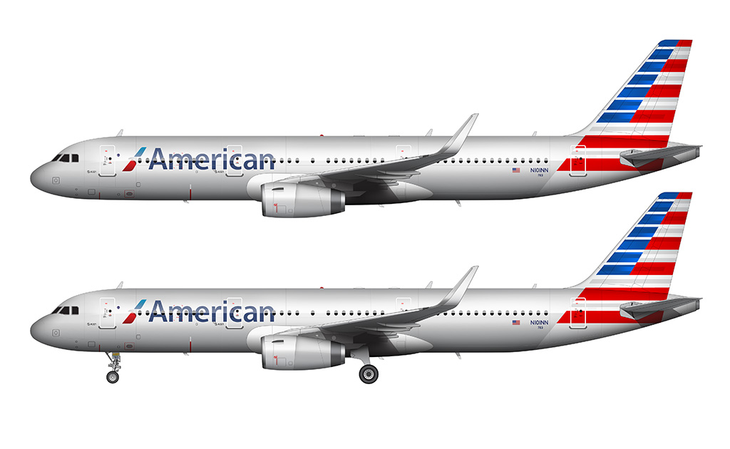
An all-new American Airlines livery: 2013-present
An all new American Airlines livery was unveiled on January 17, 2013, and it was a stark departure from the “bare metal” livery it replaced. Futurebrands had quite a challenge on their hands when accepting this assignment.
It’s not easy to take something as iconic as the 30+ year old American Airlines identity and give it a modern look. No matter what they did, they were undoubtedly going to tick some people off. But you know what? They succeeded magnificently.
It’s also worth noting that I find it rare for a major airline to create a livery which is more bold (and daring) than younger “hip” airlines. For example, I much prefer this AA flag livery over the livery of Breeze Airways (a hip young startup airline in the US).
The new look for American Airlines was a bold departure from the past. Mainly because the rumors that the bare-metal look would not be a part of the new color scheme actually came true. This was due to the fact that many modern airliners aren’t actually skinned with aluminum anymore. It’s not so easy to polish carbon fiber to a mirror-like finish!
Even though we all knew this was coming, I was actually at a loss for words when I first saw it way back in 2013. It was nothing like I thought it would be. I knew that the iconic polished aluminum fuselage was history, and that silver paint would be used instead. And I had a pretty good feeling that they would stick with a red, white, and blue color scheme. But still – it was nothing like I thought it would be.
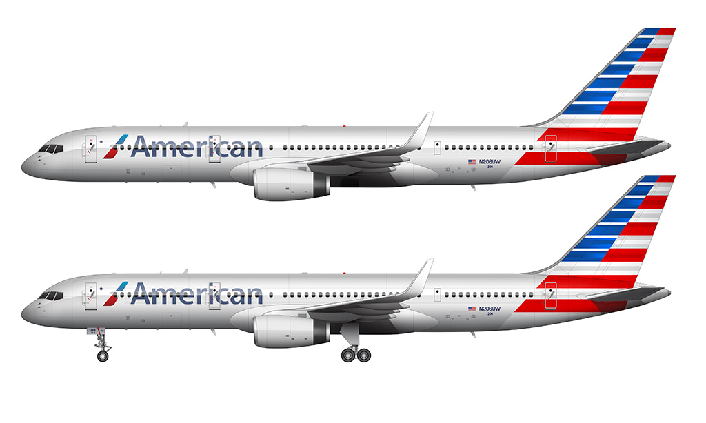
In regards to the tail, I was hoping to see something a bit organic and flowing (like the representation of the flag in the Emirates livery). Instead, we got a hard-edged and highly abstract American flag. The concept in and of itself is good – I quite like the idea of incorporating the flag into the livery. But I personally feel it’s too busy and not complimentary to the new logo (which, as a matter of fact, I love).
An all-new American Airlines logo is a major part of this livery, and I think it’s a classy evolution of the classic “AA” eagle logo it replaced. It’s unfortunate that they didn’t place it on the tail though, as the darn thing is in the shape of an aircraft vertical stabilizer for crying out loud.
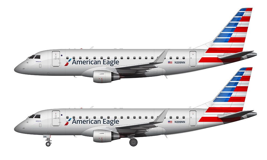
These colors look absolutely fantastic in bright sunshine (even better than the old polished livery did), and the silver paint they chose for the main section of the fuselage has a perfect balance of bling and class. I know that there are many out there who don’t feel the same way about this new look, but I’m liking it more and more each time I see it out in the wild.
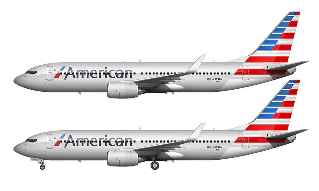
This was a controversial livery to say the least. So controversial, in fact, that American Airlines asked their employees if it should stay or go several months after it’s initial release. The results of that poll were close, but long story short – this color scheme was here to stay.
American Airlines special liveries
American Airlines has been relatively cautious when it comes to special liveries. Nearly all of the special color schemes that they’ve released over the years have been relatively mild and largely based on the current livery.

I noticed that it had the star alliance logo. American Airlines is part of Oneworld
I love all of them, I fly a one world 777-300er
I am a dyed in the wool AA fan. I do like the livery, but I have often wondered how an updated version of the lightening bolt livery (what you refer to as Astrojet) would have looked. Also, I wish the color was more silvery looking, like Northwest used to have. I also would have liked to see a more Eagle looking logo, rather than this modern, minimilistic eagle. The eagle is such a beautiful symbol of flight, the USA, and American Airines, so I would liked to have seen more of it. I know they wanted to modernize and I agree, but something tells me an upgraded lightening bolt in red or orange, along the fuselage, with a more silver color, and a more realistic image of an eagle would have been dynamite. Any thoughts??
That sounds like a good idea actually, though I’m a pretty big fan of the polished aluminum. However, with all the composite-skinned aircraft they have these days, silver paint (just like how Northwest did it) would be the only way to go. Maybe I can try to mock it up if I can find some extra time…
This is just a random nitpick but, on the classic 68-13 livery the Eagle between the double A’s always is in flight. Much like flags reverse on planes like ships do, AA actually had the Eagle always face the nose, so while in print the Eagle faced the right (blue) A, on the tails it was dependent on the side of the aircraft. (the same is true for American Eagle during this time, the Eagles fly into the wind)
Interesting! I didn’t even notice that. It makes total sense given how they do the same thing for flags. Thanks for letting me know! I’ll have to go back and update that eventually…
beloved livery – mica grey American ! I’ve started CRJ-700 BPK model in this scheme…
Hope it’s going well! It’s not an easy one to replicate.
Completely agree about the tail of 2013-onward – it’s never made sense to me, and it’s jarring. Why are there white pinstripes in the blue field (are they supposed to be stars moving quickly?), and why don’t the blue stripes align with the red and white stripes?
I think a tail showing the stylized eagle chevron (which appears near the nose) would be much better; perhaps that was rejected as being to close to United’s old (1960’s) logo, but honestly about anything would be better than the brash be-lined flag.
It just floors me that they chose such a complex livery over something more simple (based on the official logo). That abstract American flag livery can’t be cheap to apply to aircraft – and I’m sure the cost adds up given the overall size of their fleet.
I gotta say, when it first came out, I did NOT like the new livery. But, it’s started to grow on me a bit. However, it doesn’t hold a candle to the livery Vignelli created.
I don’t think anybody liked the new livery when it first came out lol. But I’m right there with ya – as time has gone on, I can confidently say that it looks great on every aircraft in the fleet.
I think that one of the best examples of the Eagle livery was the 747SP. Sure, American only had two in their fleet, but they looked really good with the exposed steel livery.
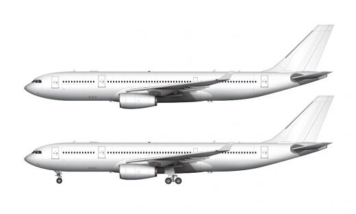
I’m surprised you never mentioned that American’s A300s initially being painted in some shade of gray, or that N791AN had a special oneworld livery which was borderline completely unpainted as seen on https://commons.wikimedia.org/wiki/File:Aa_oneworld_b777-200er_n791an_arp.jpg . Do you know why the A300s were painted gray initially?
The newer generations of Airbus Aircraft are made of composite materials (and can’t be polished like Boeing and McDonnell Douglas aircraft can). But wasn’t the A300 skinned in aluminum? Good question – I’m not sure why they were painted gray.
I’ll definitely mention it when I add an AA A300 illustration to this post!
So thanks to the magic of airliners.net, I found out that N90070 used to look like https://www.airliners.net/photo/American-Airlines/Airbus-A300B4-605R/7303649?qsp=eJwtjcEKwjAQRP9lzx4iCGpv9QPUgz%2BwbIYaiE3YXcFS%2Bu/G4G1485hZScrs%2BPhjqaCBDKzypB1VVn4ZDSsppmSu7KnMo/ibc/Ou5xCOoXlW1C9LI5EdowiqI/75TSP0V8GkT07tYt8C9N4znQ6Nx2Q1c9%2BAc8q0bV8zuTHp in 1997, but it later looked like
https://www.airliners.net/photo/American-Airlines/Airbus-A300B4-605R/1197659?qsp=eJwtjcEKwjAQRP9lzx4iCGpv9QPUgz%2BwbIYaiE3YXcFS%2Bu/G4G1485hZScrs%2BPhjqaCBDKzypB1VVn4ZDSsppmSu7KnMo/ibc/Ou5xCOoXlW1C9LI5EdowiqI/75TSP0V8GkT07tYt8C9N4znQ6Nx2Q1c9%2BAc8q0bV8zuTHp this in 2007.
Another oddity I found: Both N951AA and N905NN were both painted in the older Astrojet scheme, but if you compare the two side-by-side…
(N951AA) https://www.airliners.net/photo/American-Airlines/Boeing-737-823/2825289?qsp=eJwtjcEKwjAQRP9lz16KKNhb/AD14A8sm6EGYhM2K1hK/71r8Da8ecysJGU2fO25VNBIDazyogNVVn43GldSTKmZsqUyB7EPZ/dul9MQgnutqF0XJ5ENQQTVEP/8rhH6q9CkT05%2BMXiAPnqm49l5TK1m7hswTpm2bQc/JDIH
(N905NN) https://www.airliners.net/photo/American-Airlines/Boeing-737-823/4421477?qsp=eJwtjUEKwzAMBP%2Bicw4tpNDklj7A7aEfELJIDW5sJBUSQv4eYXpbZofdHagsxqu9t8owgjIKfaCDioJfhXEH4TmpCVoqy0T2w%2BxeGC63ENzTIvbYnEQ0noi4Gsc/f0pk8QqV2uLsD1cPLK%2BW4d47j0lrxjbBhinDcZwRdzG7
…you can see that N905NN has a gray belly for some reason, and N905NN’s eagle is facing backwards!
Good detective work! I love discovering little inconsistencies like this. There’s no shortage of them!
As someone who’s been in the Airline industry for 35 years – YES, AA’s 1968 – 2013 “Eagle” livery needed to go much earlier than it actually did. I love the polished aluminum look on the OLD 727s, EARLY 737s and DC9s, but if you look at [ certain ] old photos of AA’s later 737s [ ie: – 823s ] , and really even on the MD-80s , with the GRAY Wing Root Fairings, GRAY Engine Cowls and GRAY Tail Cone, you can SEE the large sections of painted gray jarring against the polished aluminum that just looked horrible and unprofessional :
https://imgproc.airliners.net/photos/airliners/5/3/6/7411635.jpg?v=v423db374aa1
https://cdn.plnspttrs.net/41425/n564aa-american-airlines-mcdonnell-douglas-md-83-dc-9-83_PlanespottersNet_330634_bab0fa61d3_o.jpg
I HATE the post-2013 “Flag” livery — UP CLOSE it’s far too busy — too many red and silver “broad” stripes [ 6 each ] – the thin silver lines running through the blue field , creating 7 blue “broad” stripes that are misaligned with the red — BUT FAR AWAY – like at the End of Runway when looking from the gate – it looks great — and I think this is why it was chosen — it’s a “design trick” to create “action” .. “brightness” .. “depth” — it would probably look “dull” or “static” or “boring” if the blue was a solid field without the silver inter-lines .. — I don’t know .. I haven’t tried playing with different variations to its layout ..
The “metallic-silver-aluminum” fuselage paint is beautiful and “almost” looks like unpolished aluminum — not quite but pretty close .. but I would’ve gone with a different “Tail Flash” — maybe FIVE Red and FIVE Silver “Bar” Stripes instead of six [ THREE RED/TWO SILVER on the Vertical Stab instead of Four/Three ] and SIX Blue “Bar” stripes instead of seven — to hopefully make it look a “little less busy” without the “bar” stripes becoming too fat [ which they might anyway with the count that I’ve provided ] .. or maybe SIX Blue “Bar” Stripes that align better with the TOP SEVEN Red and Silver “Bar” Stripes — though I have a sneaking suspicion that THAT would make it look LESS like an American Flag and more like some weird “corporate art project” .. a strange “ladder” with missing steps on the red half ..
Another option might be a “SILVER Eagle Flying”, between the blue solid field, fwd, and the Red and Silver stripes, aft, its FLARED WINGS stretching vertically ..
You’re exactly right about the 2103 livery looking great from a distance. It definitely stands out from all the rest. Well, except for maybe Spirit lol.
I actually like it up close as well. It took a few years to grow on me, but I think it’s pretty slick.