Airline livery design isn’t something that I do very often, though I will admit it is something I’m really interested in and I want to do more of if. There’s just so much that goes into creating a great livery, and getting it to “fit” and flow correctly on an aircraft is a lot more challenging than it sounds.
Especially when it comes to applying the same design to different airplane types. What works on one airplane doesn’t always work on another, and I enjoy the challenge of creating one cohesive design that can work in a variety of different configurations.
Most of you probably don’t know this, but my primary clients have me doing mobile app design 99% of the time, and this “airplane stuff” is just considered a creative hobby for me. Any chance I get to do custom livery design is considered a treat, and if my schedule allows it, I’ll usually jump all over these kinds of projects as fast as I can.
How I created a custom livery for a Boeing 787-8
The example below is a series of livery concepts that I created for Engio (now AirExpert). They needed a few quick illustrations to promote a mobile app they were working on.
This particular client already had logos for me to use, so it was just a matter of applying them (in a creative way) to my Boeing 787-8 template. I wasn’t given much guidance other than keeping the logos large, clear, and easy to read, which was really important since these illustrations would be used as marketing material for promoting the app.

I immediately thought to use the shield logo as the basis of the livery, somehow leveraging the shapes and forms that made up the shield into something more abstract that would flow seamlessly horizontally from nose to tail.
I needed to keep the design relatively simple though – after all, the client’s logos needed to be the primary focus and a busy livery would only get in the way.
The concepts that I came up with
The concepts you see below took about 3 hours to put together. They are all based on the same general design, which made things move relatively fast. However, airline livery design is anything but fast. It’s painfully slow actually. Here’s what I managed to come up with:
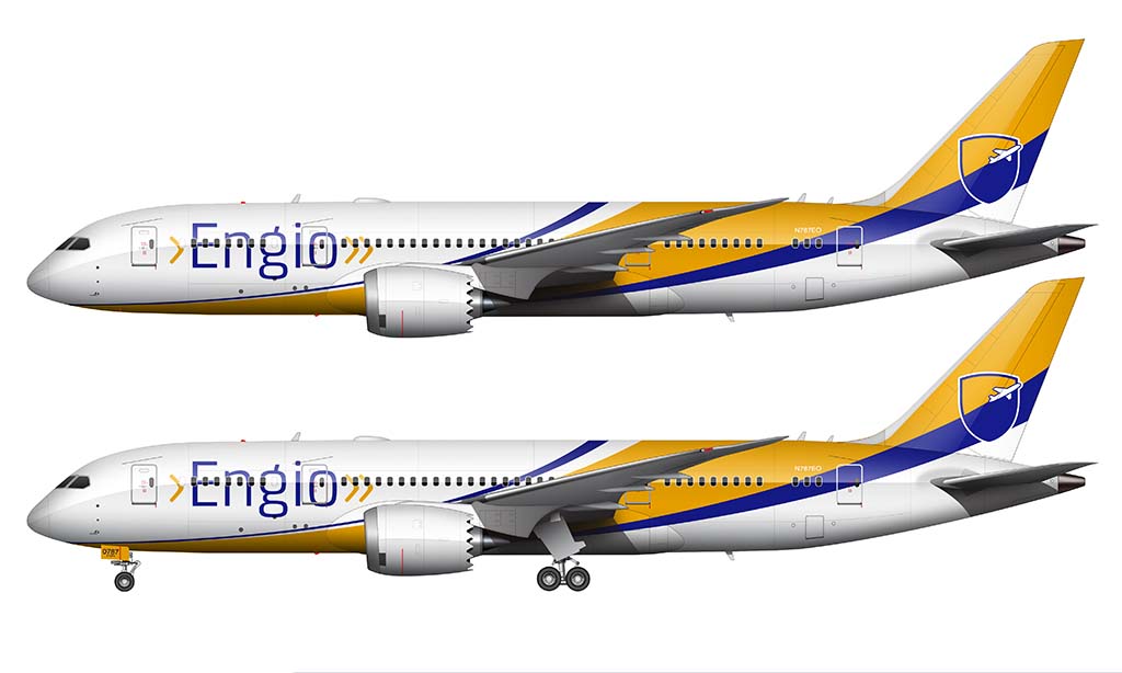
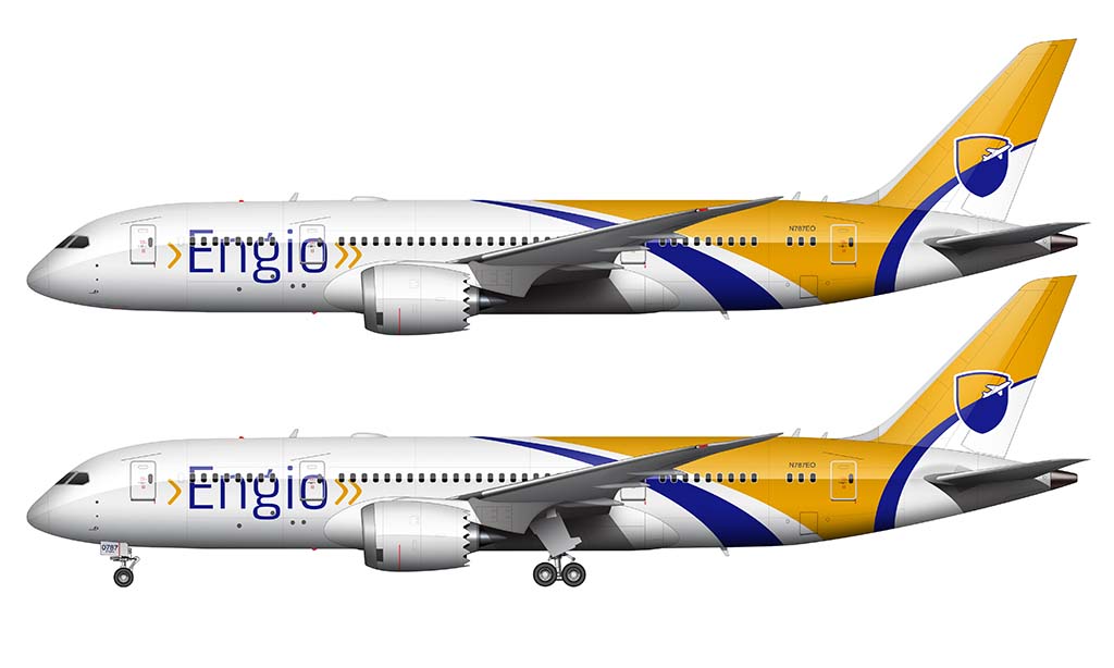
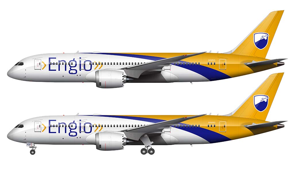
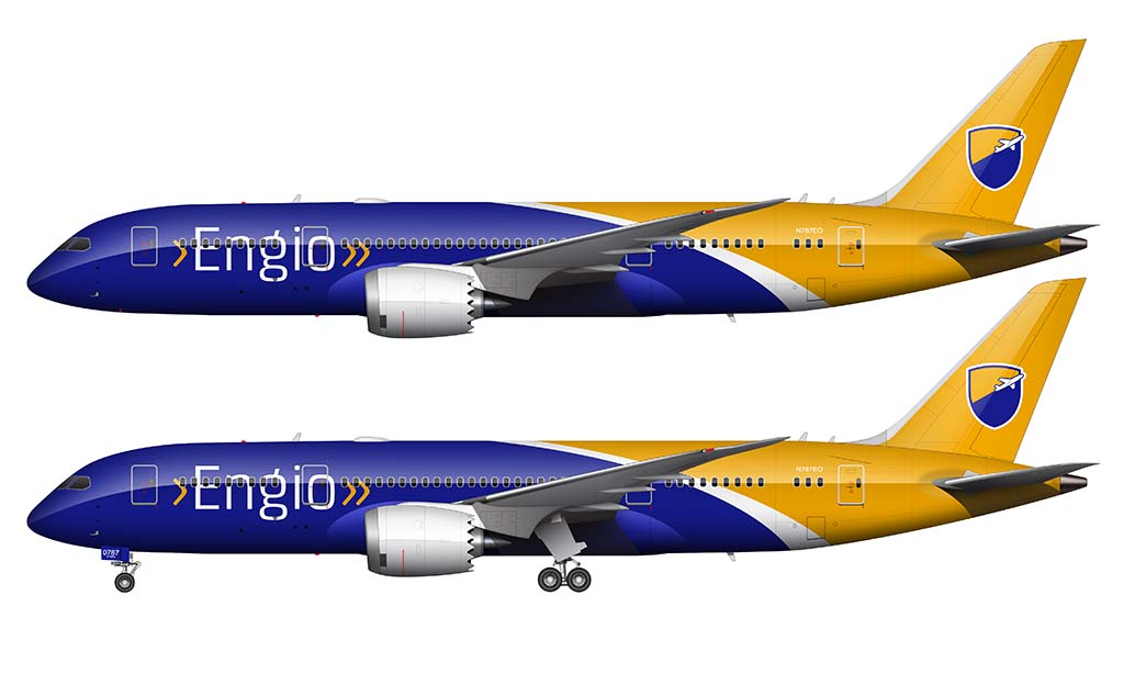
If it weren’t so important to keep the Engio brand name as noticeable as possible, I definitely would have used color on the engines. I tried a couple variations with swoops of blue and yellow on the engine covers, and it looked pretty cool – but unfortunately, I thought it was a bit too distracting and it wasn’t the right thing to do to meet the objectives of this design. But that’s the way it goes sometimes. Compromises are just part of the design process.
A more detailed explanation of how I create custom airline liveries
The best way to explain my process for coming up with custom livery designs is to show you in-real time. Here’s a video of how I came up with a livery for my Boeing 797 template:
As you can see, the process is relatively simple:
- Start with a clean template (a subtle plug for my aircraft templates)
- Draw the rough shapes in Adobe Illustrator (or any decent vector illustration app)
- Once you get something decent looking, paste them into Photoshop (or any decent photo editing app). The reason why I don’t like using Illustrator (or equivalent) for this is because it’s much easier to add shadows and gloss in a good photo editing app like Photoshop.
- Swear and curse if you must.
- Present your concepts to your clients, and get paid handsomely. It’s that easy!
Well, as you saw in the video, there’s a lot more to it than that. Steps 1-3 are fairly accurate though, and with enough practice and patience, you’ll be a talented aircraft livery designer in no time.

Very clever – very corporate. I prefer No 2 as I think it’s the most original.
It’s a fun sized plane to experiment on.
🙂
Thanks! Yeah, the proportions of the 788 are perfect for this sort of thing. A simple (yet stylish) shape that doesn’t overpower the livery.
How to make this liveries?
It wasn’t so difficult actually. I drew the shapes in Adobe Illustrator, then imported them into my Photoshop PSD file to add in all the shading and gloss.
I don’t use Photoshop I use gimp some people may be mad at me for it but it’s great for creating airliners as well I’m not as advanced as this dude but I’m getting there I still have a lot to learn
Gimp is perfectly fine IMHO – I know some very talented artists that use that exclusively, and you’d never know by looking at their work. It’s more about talent than it is the tools!
I like #4 … as for the engines, what about putting the shield logo on the sides of the engines?
Come to think of it, you could also do the shield logo in place of the “Engio” billboard, and use the gold carats on the tail (and/or engines).
Good suggestions! Looking at these concepts with a fresh set of eyes, I agree that the “>>” graphics could make for a very nice (and well branded) design element on the vertical stabilizer.