Despite the fact that the Concorde is one of the most unique looking commercial airplanes ever built, it’s also one of the simplest. At least when viewed from a side profile.
It’s an aircraft best viewed from slightly above or below, and drawing it in a completely side on perspective (as is typical of my aircraft template style) makes it hard to see all the design elements which makes this aircraft so unique.
Blank side view templates of the Aérospatiale-BAC Concorde
Creating this set of side view drawings for the Concorde was both extremely easy and infuriatingly difficult. It was easy because of how simple the overall shapes are. On the flip side, it was difficult because of how simple the overall shapes are. I’ll explain what I mean in a moment, but here are the templates:
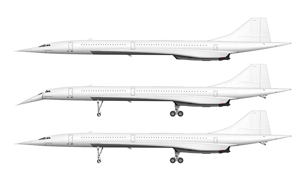
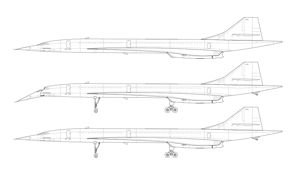
Fully editable 7000 x 4200 px high-resolution source files for these templates are available! Get them in JPG, PNG, PSD, and vector format.
So yeah. Creating the base outline for these templates was relatively easy. The Concorde is basically a giant wedge shape, and there’s actually very little to it.
This is the set of templates that taught me how problematic “simplicity” can be when creating side view aircraft drawings. If there’s not a lot of detail to show, the templates end up looking relatively simple and not very detailed.
I love creating extremely detailed aircraft illustrations (my Beechcraft 1900D is a good example), and drawing the Concorde didn’t give me the sense of satisfaction that I normally get after completing a complex set of illustrations. It wasn’t supposed to be like this! (lol)
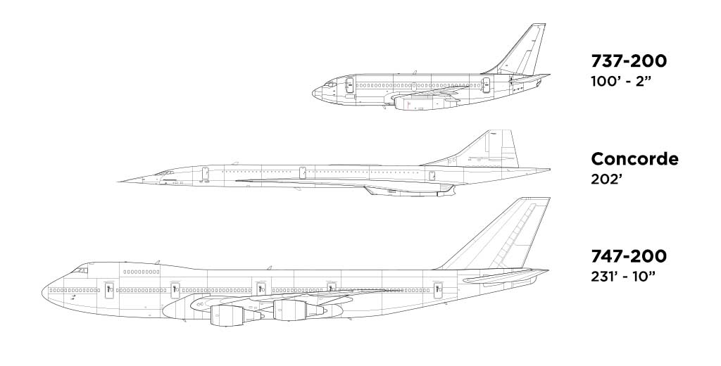
The neatest design details
The Concorde is one of the only aircraft in existence that I’ve had a lifelong fascination with (the 747 is the other airplane that always made me weak in the knees). It was the very first aircraft I ever drew a picture of way back in elementary school, and it’s unique design elements had everything to do with it.
It looked like a fighter jet (which no 10 year old boy can resist), and I’ve never lost that initial fascination. Here are some of the reasons why:
- The Concorde is a “tailless” aircraft. This means that the only horizontal surfaces are the main wings themselves. There are no vertical stabilizers attached to the tail.
- The drop nose design (also sometimes referred to as “droop nose”) was very unique to commercial aviation. The Tupolev Tu-144 was the only other commercial airliner to feature it.
- The droop nose consisted of two main pieces: the main nosecone, and the retractable visor. They operated independently of one another, since dropping the nose alone didn’t provide enough visibly for the pilots during takeoff and landing. The visor retraced fully into the nosecone during takeoff and landing, and was fully raised during flight for maximum aerodynamics.
- The FAA (Federal Aviation Administration) objected the first design proposal for the retractable visor. It wasn’t until the engineers switched out the glass to a stronger material that it was eventually approved.
- The delta wing design (a wing shaped in the form of a triangle) was also very unique. It’s main advantage was it’s performance and efficiency at supersonic speeds. It’s a lot more complicated than that though, so I recommend reading the Wikipedia page about delta wings if you’re in the mood to read about the kinds of physics and math that will make your head hurt.
- The landing gear (both front and rear) are as long as they are to allow for the high angle of attack during takeoff and landing (a drawback of the delta wing design).
- That high angle of attack necessitated the addition of a tail wheel (to prevent tail strikes during takeoff and landing).


Can you make a DC-3/DC-2 side view?
DC-3 is coming!
Hello Norebbo pls make Tupolev Tu-144 🙂
I’ve already promised the DC-3 and AN-225 to multiple people. Gotta do those first!