I’ve been on a roll with my airliner template collection over the past two years or so, but my main interest in art and design continues to be 3d modeling and rendering. It’s still a core part of my billable work these days (which I’m thankful for), but I will admit that I haven’t had as much time as I would like to create the fun “logo” renderings that I used to do all the time several years back. It’s not like I’ve grown out of that kind of conceptual illustration, but there are so many other things that have a higher priority these days. But very now and then (like now) I get an itch that needs to be scratched…
Several weeks ago I bought a car though CarMax, and I’ve got to say that it was a surprisingly pleasant experience. I was so happy as a matter of fact, that I wrote a lengthy article for a my automotive blog (yet another one of my endless list of side projects) describing how it all went down.
It was a long article – pretty much what I’d call an intimidating wall of text, so I desperately needed some images and illustrations to sprinkle in order to make it look somewhat inviting to read. I know that I hate to read large blocks of text without any visual breaks, so I thought I would give my readers a break and add in some flair – norebbo style!
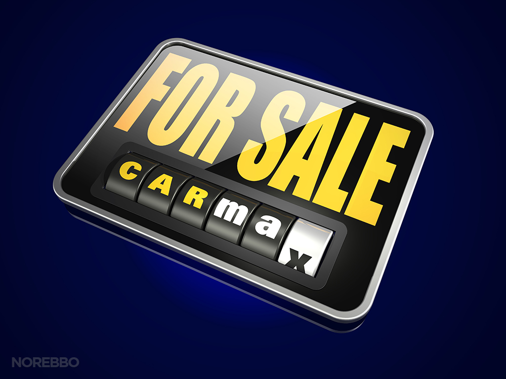
The main issue I faced was that the CarMax logo is basically…well…plain and simple. These two traits don’t translate well into to fun and interesting 3d renderings, so I had to get a bit creative and add in a host of other elements and objects in order to make things interesting.
The overall theme I stuck to was buying and selling (that’s what CarMax does), so I resisted the urge to get too crazy and create illustrations that ventured too far off that path. Besides, I’ve learned long ago that less is more, and sticking with a single concept is better than aimlessly creating a set of conceptual and editorial illustrations that don’t make much sense. I was guilty of doing that in my early days (moreso than I’d like to admit), but these days I only create these kinds of renderings when I need to illustrate a specific idea or concept.
You probably noticed that with my Harley Davidson logos and Starbucks logo image sets – these were both relatively small collections and I pretty much stopped when I ran out of ideas (unlike my Apple logo series, which went on for far too long).
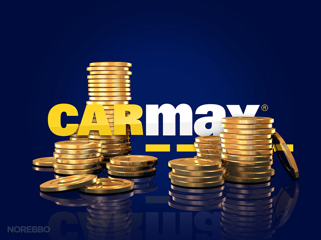

It felt pretty good to roll my sleeve up and crank this set of illustrations out. I’m still doing these in FormZ, by the way, despite my claim several years ago that I was switching over to Maya. I’m still using Maya quite a bit, but not for this kind of work. FormZ is much better for simpler renderings like this (Maya takes forever to render) and it’s only going to get better once V-Ray for FormZ is officially released. I can’t wait!


