I’m not sure how I missed it, but Google updated their logo earlier this week and produced a really good set of design guidelines for it. All I can say to that is: FINALLY! Their previous logo looked like something that was created in Microsoft Word way back in 1997, two hours or so right before a big meeting. It was in dire need of a refresh, especially considering how much emphasis this company has been putting on visual design over the past few years.
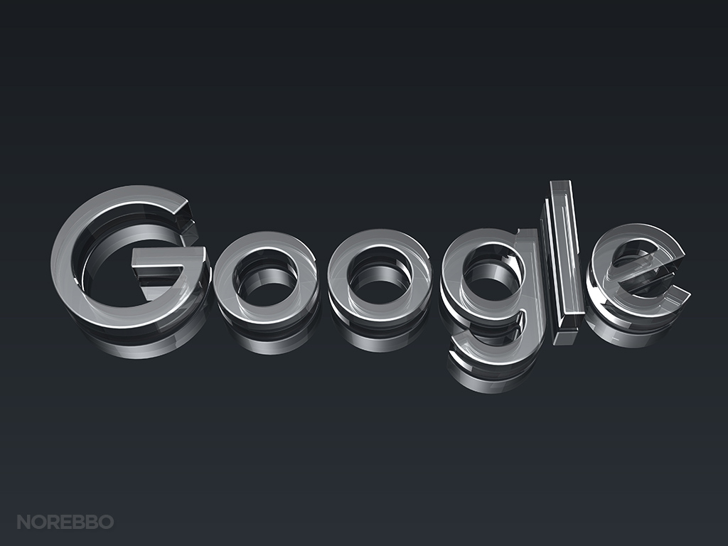
I’ve already produced a full set of 3d renderings featuring the old Google logo, and back then it was really difficult to come up with a collection of images that I was happy with. The old logo was really hard to work with – mostly because it didn’t look sophisticated enough IMHO – and I was never really happy with that set. But this new logo is much better!
It’s based on simple geometric shapes that look very balanced when spelling out the “Google” title, and the added benefit to this simplicity is how easy it is to animate. These animations and transitions are a core part of the current Google design language, and I like what they came up with very much.
Also, I didn’t realize it until I started building the 3d model, but the circular shapes are not exactly symmetrical – this is a truly custom font that took a bit of work to replicate on my own. I’m not sure I would have even noticed that if I hadn’t created these renderings!
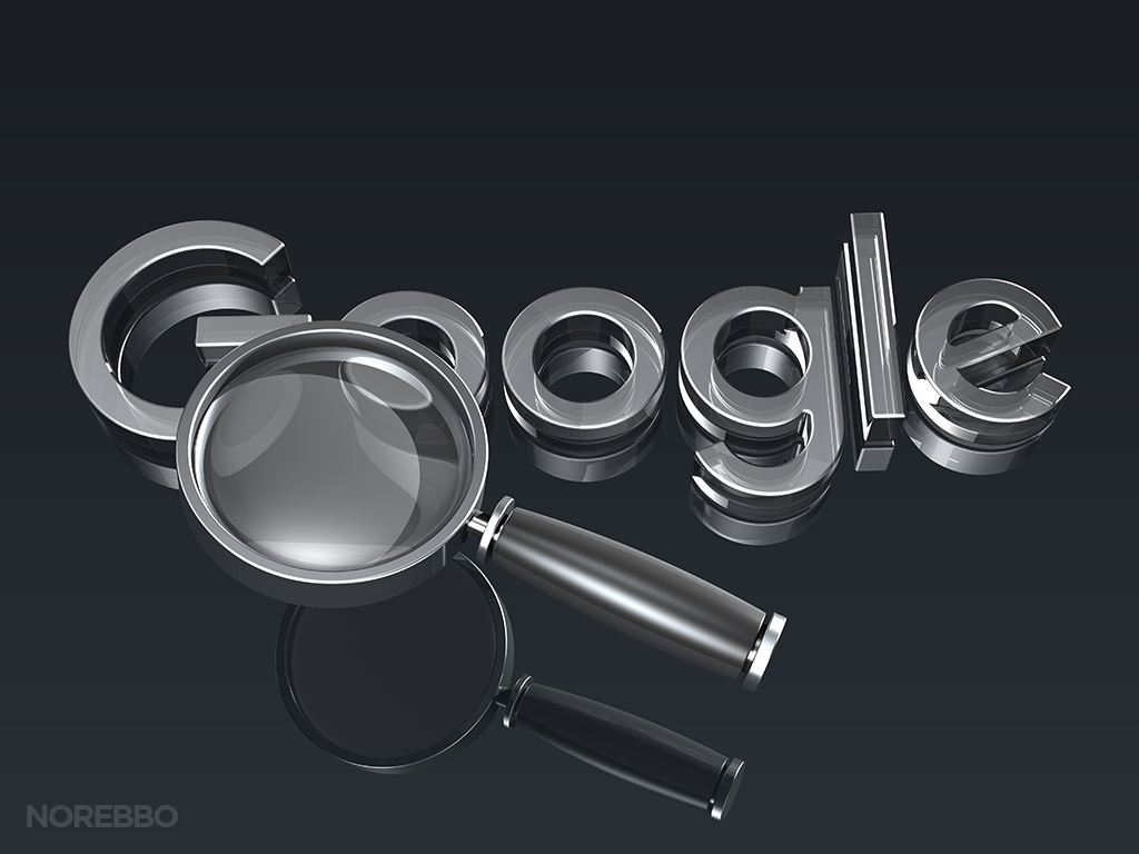
Anyway, a long time client of mine needed a few quick 3d illustrations of the new logo for a presentation he was working on and these three are what I came up with. The primary focus of these illustrations was to emphasize “search” and “settings” topics, so it wasn’t really important to render the logo exactly as it was designed.
As a matter of fact, it was more important for the objects themselves (tools and magnifying glass) to be more prominent than the logo so that’s why I didn’t use color. Yes, I realize that I broke nearly every guideline in their design documentation, but these are just conceptual images anyway so it’s not that big of a deal. I just hope the Google Brand Police don’t come knocking on my door…
On a side note, flat design is all the rage these days so it’s been interesting and fun to take flat logos such as this and translate them into 3d. Sometimes it works, and sometimes it doesn’t – but it’s the challenge that I enjoy so much.

