Wearable technology is all the rage these days, but I’ll admit that I haven’t been tempted by any of it. Head mounted displays (HMDs) and smart watches aren’t fully matured yet, and most of the products currently on the market just seem so…compromised.
But I know all too well how fast technology moves, and I’m sure it won’t be long until you see me sporting the latest tech/fashion gadgets – heck, I laughed the first iPad off as a “worthless piece of crap” the day it was announced, but I’m not going to lie when I say that I can’t live without my Apple tablet today. Yeah, I can be stubborn and short-sighted sometimes…
Anyway, last year I created a series of generic smart watch designs for stock illustration purposes. The images you see here are the best examples from two different sets. The first batch I created (at the bottom of this post) was based around a very simple and blocky design, which I never really liked all that much.
That lack of satisfaction kept eating at me for several months, so I decided to give it another go with a slightly more detailed and curved design. The illustration of the red smart watch at the top of this post is from that second set, along with this chrome one:
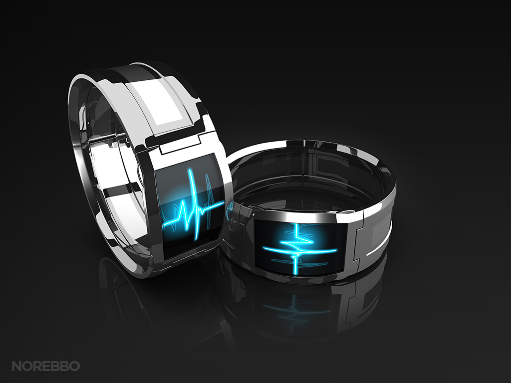
And yeah – I created these in Maya just as I was still learning my way around, so they took far too long to stage and render (which is the same problem I had with my forklift illustrations). For comparisons sake, the illustrations of the more angular smart watches (below) were created in FormZ within a matter of hours – fully rendered and all.
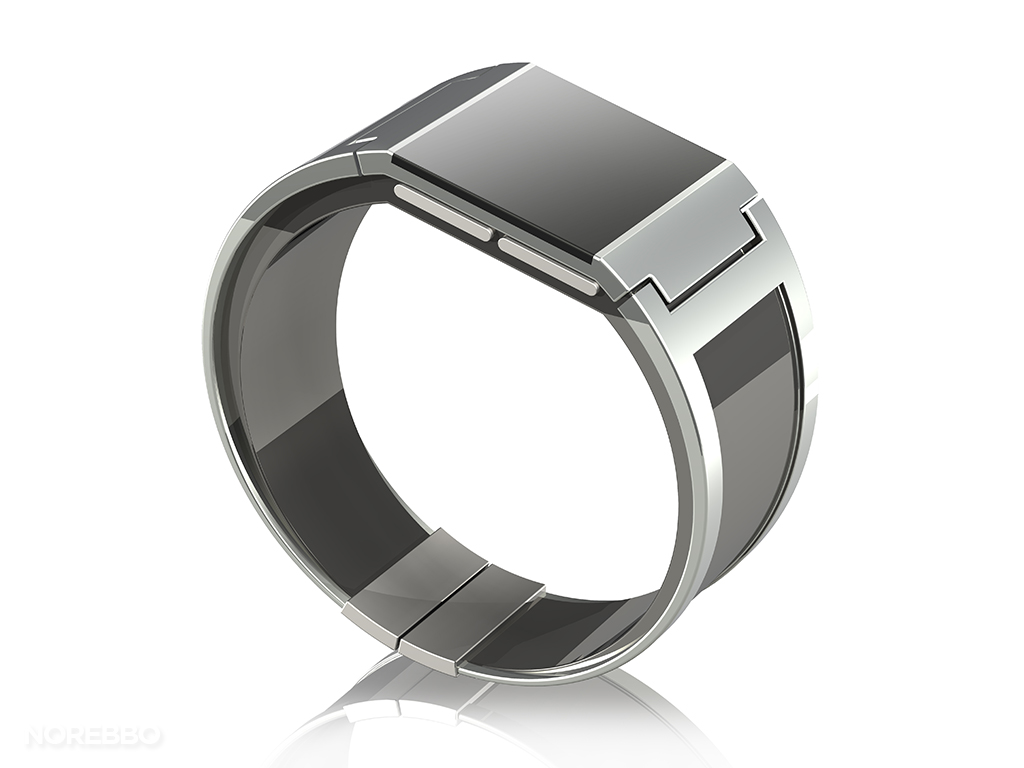
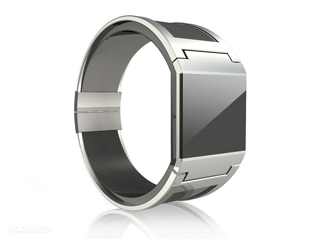
If you need to map your own custom design onto the face of the display, these blocky watches will probably serve you better. That’s precisely why they look the way they do – I knew that most people who use these images will need to customize them somehow, and a curved screen would give even the best Photoshop professionals serious heartburn.
I may do more of these in the future, so stay on the lookout.


