Inspired by a rumor thread on airliners.net, I was thought it would be really cool to mock up a preliminary illustration of a United Airlines 787-8 in the 1980′s Saul Bass livery. I was a bit skeptical at first, but after looking at it for a little bit, I’ve got to say that I’m really liking it. I really hope UA does this!
What a Saul Bass United Airlines 787-8 Dreamliner might look like
Creating these side-view drawings was fairly straight forward, but I did have a bit of difficulty placing the main United Airlines titles at the front section of the fuselage.
The problem is that the Dreamliner’s windows are very high in the airframe, which pushes cheat-line colors really high as well. The orange stripe in the middle is historically where the windows have been positioned in the United Airlines livery, so that left a very small vertical space for the main titles. I would have personally liked to make them larger, but there’s just no room to do so.
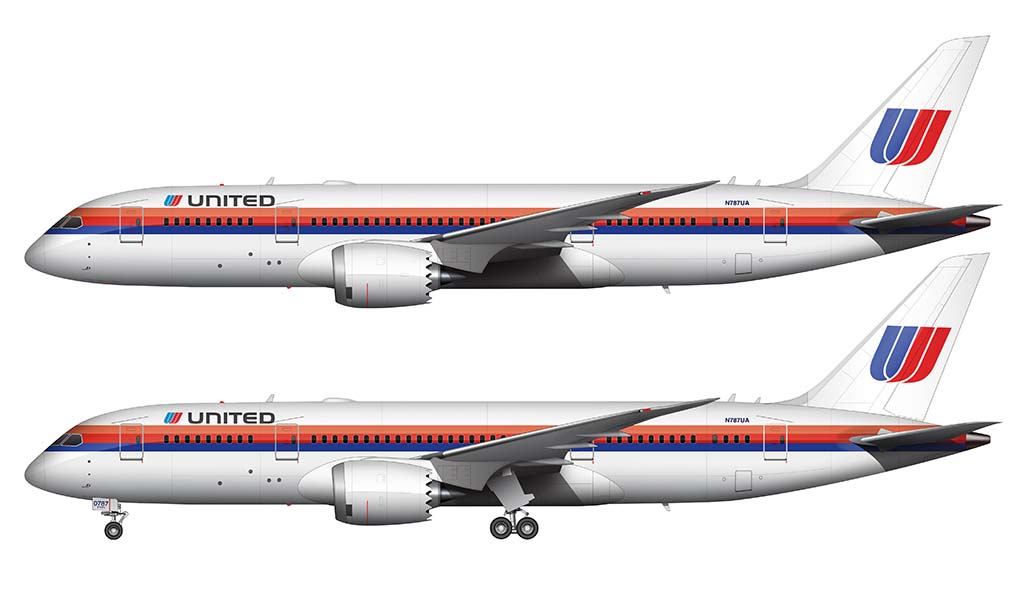
An alternative version of this retro United 787-8
Because I can’t leave well enough alone, I wasn’t really happy with the way that the titles were placed in the illustration above. I thought they were a bit too small, but there wasn’t really anything I could do because of the way the cheat line was situated.
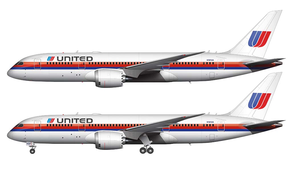
However, after doing the first iteration, I learned that UA actually had a variation of this livery with larger titles – which was used primarily on the narrow body aircraft. The difference was that the cheat line was moved down on the fuselage so that the orange stripe ran through the windows (instead of the red stripe). I think this looks much better applied to the 787.
I’m really glad that airlines see the value in these retro liveries. While this Saul Bass United Airlines 787 is purely a rumor at this point, I really hope it eventually becomes a reality. Die-hard 1980′s airline nerds like me would really like to see it!

Howdy Scott! Do you have a moment for a Saul Bass livery related question?
Hey Ryan – sure…I’m not an expert on the UA Saul Bass livery, but feel free to ask anything!
I didn’t realize this was posted to the site, I apologize. I’ve submitted my questions via the email link below.
I really miss the tulip. I am much happier with the new “evolved” globe in blue, but the tulip was just so special. I prefer the normal size tulip, like on your illustration, rather than the magnified one on the rising blue livery. I loved the rising blue fuselage, but I would have preferred a regular size tulip on the tail. The rainbow livery as you are illustrating was also a grand livery–so colorful and happy. Oh well, I guess we will just have to be happy that the evolved livery is much better than the blue and gold prior. It was shocking to me that after executing one of the largest mergers in airline history, the went with the bland and old Continental livery. Probably financial.
I’d like to think that they will eventually go back to the tulip in some form or another. It may not be exactly the way it was, but my fingers are crossed that it’ll return.
Just FYI: the 3 cheat line colors from the Saul Bass livery (bottom to top) was inspired by the colors of the sunset seen from the window in flight- dark blue> magenta> orange. The much more elaborate carpeted bulkheads included the dark grey clouds below.
The reason the CO livery was selected post merger was part financial but mostly an internal way to keep both CO & UA employees happy. UA kept its much more famous name while CO employees got to keep their globe. They did not want to upset CO employees even more by painting the entire fleet with rising blue. However, the CO livery was old looking so it was modified to the “evo blue” globe. The wavy line is a nod to the new Boeing 787.