Illustrating these side view templates of the Fokker 70 was as amusing as it was satisfying.
On one hand, it was hard not to chuckle every time that I fired up Adobe Illustrator and Photoshop to continue working on this little f**ker.
On the other hand, it felt good to illustrate the much needed shortened version of my Fokker 100 template. Like, finally!
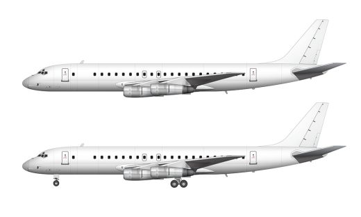
Side view templates of the Fokker 70
The fact that I had already illustrated the F100 made this a somewhat easy template to complete. There are only minor visual differences between the 100 and 70 (which I’ll describe in a moment), so it only took about 1/3 of the amount of time as usual.
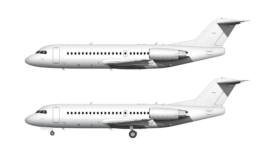
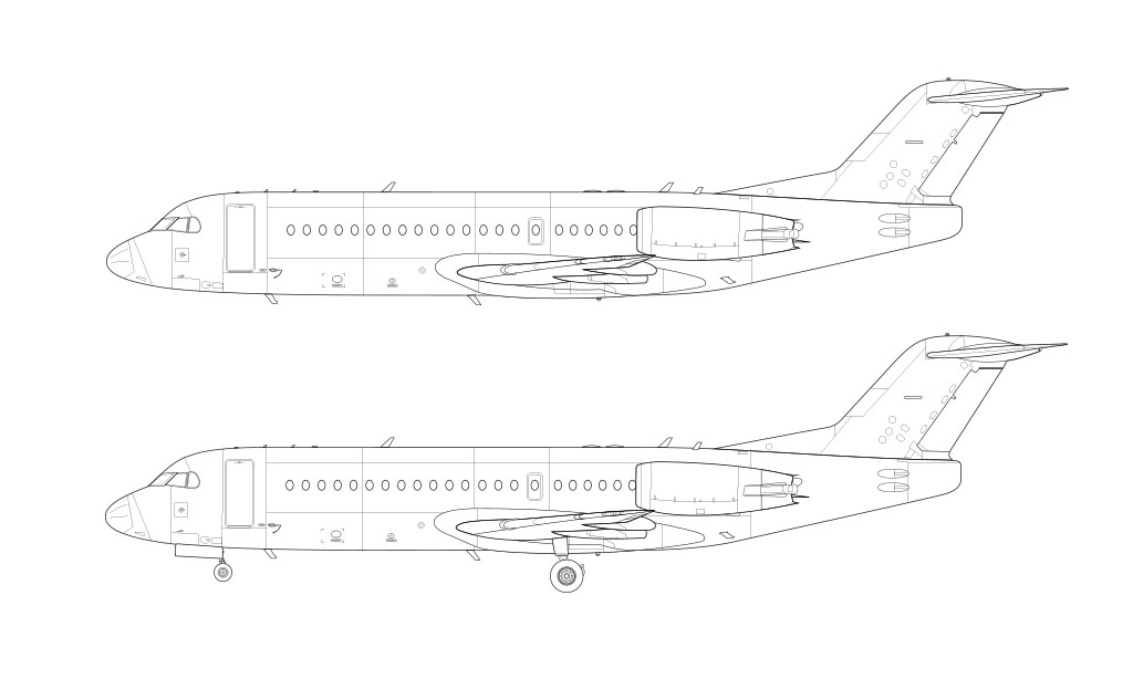
Fully editable 5000 x 3000 px high-resolution source files for these templates are available! Get them in JPG, PNG, PSD, and vector format.
Note: the dimensions for the full-size versions of these illustrations are 5000 x 3000 pixels. If you recall, the dimensions for the F100 are 5347 x 3208.
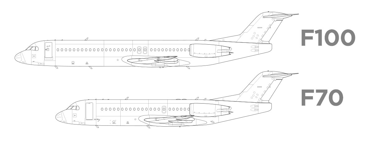
Because the 70 is so much shorter than the 100, it wasn’t necessary to utilize the wider (5347px) canvas. So – even though it’s technically a smaller illustration, the two aircraft are proportionally correct to one another.
In other words, the dimensions of all the elements match when placing one of these illustrations over top of the other.
Visual differences between the Fokker 70 and 100
It wasn’t until I began comparing reference photos of these two aircraft that I noticed minor visual differences. Every written description of the Fokker 70 that I could find made no mention of these differences:
- The pylons under the wing are completely different. Not only in shape, but in size as well.
- The sculpting of the wing box (under the wing – where it connects to the fuselage) is slightly more pronounced on the 70. It’s very subtle difference, but exists.
- Nearly every reference photo of the Fokker 70 that I found had the smaller (narrower but taller) main boarding door. This door was an option on the 100, but most (if not all) 70s seemed to have it.
- There are two fewer emergency exit doors on the 70. The 100 had two emergency exits on each side – but the 70 only had one.
- There were 22 windows on each side of the 70. The 100 had 33.
As far as I can tell, everything else is the same. The wing, cockpit windows, landing gear, engines, and vertical stabilizer are all shared components.


First comment
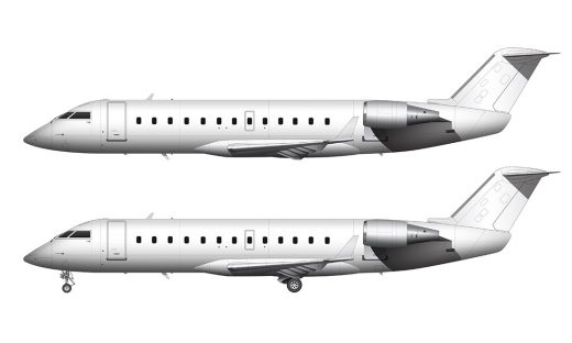
Also do a canadian airline livery, like westjet or air canada. I would love to see that! And
for aircraft suggestions try doing the CRJ-550 or something like that. I hope you answer 😀
+100 AvGeek points to you for being first!
As a matter of fact, I am planning on doing a full breakdown of the Air Canada livery. I’m very much looking forward to that one! And yes, the CRJ-550 will need to be done at some point.
Thank you for creating this Scott! Great work as usual.
Thanks Barry! And you’re very welcome. An updated 727-200 is coming very soon, followed shortly thereafter by the 727-100.
could you try to make a Train livery, something like a EMD FP45, i use your liverys offen, but i want to do some train livery stuff and it doesnt exist in a format like yours
I will admit that sounds fun (even though I’m not a train guy). Unfortunately, it’s most likely not going to happen though. I wish I had the time to work on that kind of stuff!
Thank you for creating the blank illustration of the model Fokker 70. I’d like to see the work of the Tupolev TU-134A updated.
You’re very welcome Howard! It’s amazing how many requests I get for Russian aircraft – I’m not doing enough apparently lol.
nice work
Thanks John!