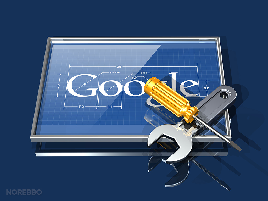
I think I can chalk this set of Google logo illustrations up as something that didn’t really turn out as I had expected. Long story short, I found this logo really difficult to integrate well into a 3d space and I don’t think I really captured the original spirit of what I had set out to do. I’m not going to go as far as to call this set of illustrations a total failure, but to say that I’m glad to be finished with this set is an understatement.
I think the core of the problem was that I don’t even like the Google logo to begin with. The full-color version of it is cheap and amateurish looking for a company of this size, which is the same sort of issue I discussed when I posted my Verizon 3d logo set.
Seriously, why do big companies such as this feel the need to hold on to the logos they started with as a small startup? The cheap looking bevel and drop shadow of this logo just screams of something that a non-designer created in Photoshop in way back in 1997 during last-minute desperate attempt to create a logo for a big presentation the next morning. I don’t necessarily mind the font – as a matter of fact, it’s unique and stylish – but the bevel and drop shadow has to go!
I tried really hard to work with the logo without altering it. I really did. But the designer in me couldn’t leave it alone, and I have got to say that I felt much better about the direction of this set of illustrations once I applied my own artistic license to it. You won’t find any cheap-looking bevels in my illustrations!
Most of these illustrations focus on “search” themes, but there are a few other concepts thrown into the mix for good measure.


