Remember Google+? Don’t worry. My memory of it is vague as well. That said, I do it recall being one of the best social media platforms on the Internet at the time. Hardly anyone used it, but the user interface was great. I really liked the logo as well.
I decided to make some 3d logos!
First, I’ll start with final version of the logo
The final Google + logo didn’t change much from my first version (as you’ll see down below). Color was the main difference. Whereas the old version was mostly black with blocks of bright color used as accents, the final version was simply red and white. That tied in a lot better to their flat design language (known as Material Design).
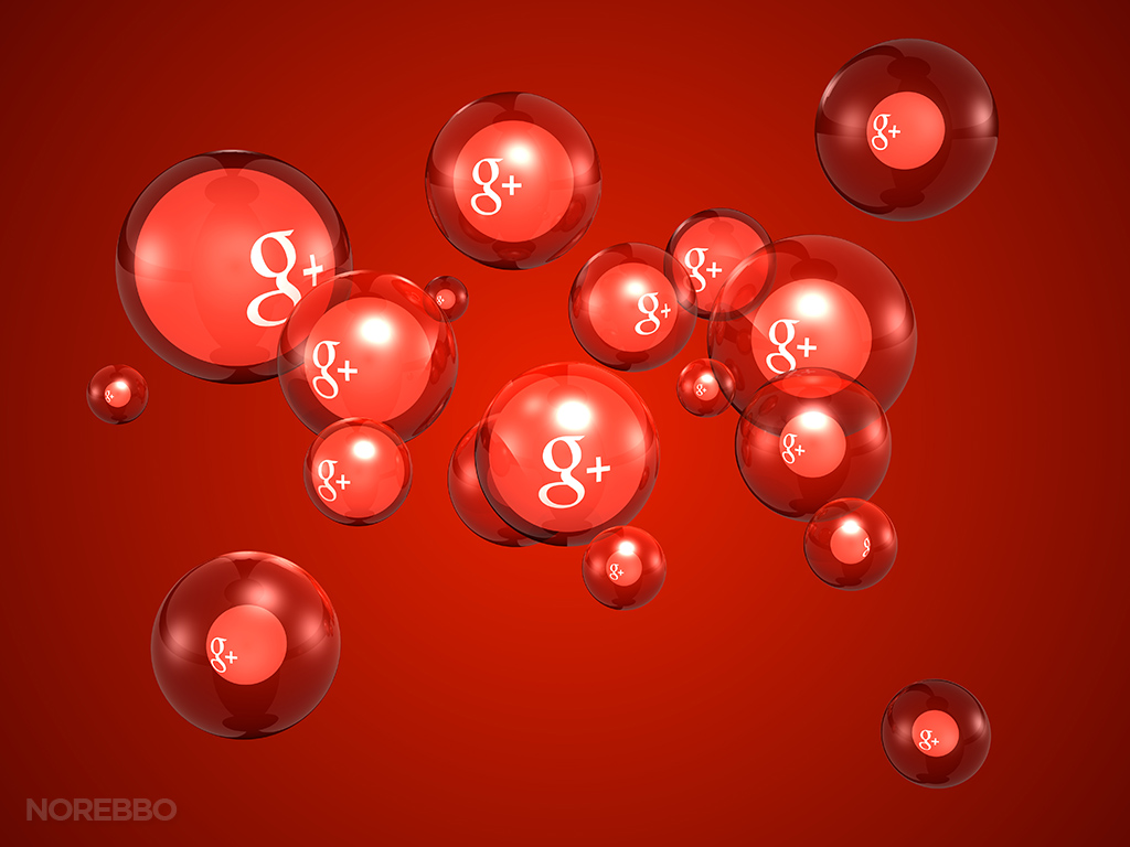
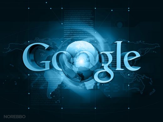
Finally, the first version
I created the following set of illustrations way back in the day (2011-ish). A few artistic liberties were made, which I guess is always kind of scary when dealing with a powerhouse such as the big G.
Do you think they’ll mind that I’ve done a few little things to their precious logo (like adding transparency and a frame)? If they promise to spare me heavy fines and jail time, I will promise to use Google+ more. Oh wait…
